- What Is an Org Chart and Why Does It Matter?
- 3 Methods – To Create an Org Chart in PowerPoint
- 1. How to Create an Org Chart in PowerPoint Using SmartArt (Recommended Method)
- 2. The Fastest SmartArt Trick Most People Do Not Know
- 3. How to Use a PowerPoint Org Chart Template
- How to Customize Your Org Chart in PowerPoint
- Tips for Making a Professional Org Chart in PowerPoint
- Common Mistakes to Avoid While Creating Org Chart in PPT
- Limitations of Building Org Charts in PowerPoint
- 3 Readymade Org Chart PowerPoint Templates
- Final Thoughts
- Frequently Asked Questions
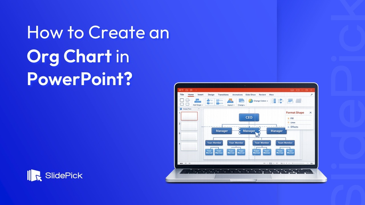
How to Create an Org Chart in PowerPoint (Easy Guide for 2026)

- What Is an Org Chart and Why Does It Matter?
- 3 Methods – To Create an Org Chart in PowerPoint
- 1. How to Create an Org Chart in PowerPoint Using SmartArt (Recommended Method)
- 2. The Fastest SmartArt Trick Most People Do Not Know
- 3. How to Use a PowerPoint Org Chart Template
- How to Customize Your Org Chart in PowerPoint
- Tips for Making a Professional Org Chart in PowerPoint
- Common Mistakes to Avoid While Creating Org Chart in PPT
- Limitations of Building Org Charts in PowerPoint
- 3 Readymade Org Chart PowerPoint Templates
- Final Thoughts
- Frequently Asked Questions

If you have ever tried to explain your company’s reporting structure to a new hire, a board member, or a potential investor, you already know how quickly words fall short. A single org chart can do what paragraphs of text cannot. And the good news is that you do not need any fancy diagramming software to build one. In this guide, I am going to walk you through exactly how to create an org chart in PowerPoint, from scratch, using both SmartArt and manual shapes, so you can pick the method that works best for your situation.
Whether you are a business owner, an HR manager, a project lead, or just someone who got handed the task of “making a slide that shows how the team is organized,” this tutorial has you covered.
What Is an Org Chart and Why Does It Matter?
An organizational chart, or org chart, is a visual diagram that shows the structure of an organization. It maps out reporting relationships, team hierarchies, and how different departments connect to each other.
Here is why having a well-built org chart matters more than most people realize:
- It helps new employees understand the chain of command instantly.
- It gives executives and investors a bird’s-eye view of the company structure.
- It makes workforce planning and restructuring decisions far easier to communicate.
- It exposes potential friction points between teams that share processes but have no shared manager.
PowerPoint is often the fastest tool available for building one because most professionals already have it installed, already know how to use it, and can embed the org chart directly into a presentation without jumping between tools.
3 Methods – To Create an Org Chart in PowerPoint
1. How to Create an Org Chart in PowerPoint Using SmartArt (Recommended Method)
This is the method I recommend for most people. SmartArt handles the layout automatically, which means you spend your time entering names and titles rather than manually dragging boxes around a slide.
Step 1: Open PowerPoint and Create a New Slide
Launch PowerPoint and either open an existing presentation or start a new blank one. Once you are in the presentation, go to the Home tab, click New Slide, and choose a blank layout. A blank slide gives you the most room to work with.
Step 2: Insert a SmartArt Graphic
Click on the Insert tab in the top ribbon. In the Illustrations group, click SmartArt. A dialog box will open with categories listed on the left side.
Step 3: Choose the Hierarchy Layout
In the SmartArt gallery, click on Hierarchy in the left-hand menu. You will see several layout options appear. For a standard org chart, select Organization Chart (the first option in the top-left corner) and click OK.
The SmartArt graphic will appear on your slide with placeholder boxes already connected by lines.
Step 4: Add Your Text
Click on any of the placeholder boxes and start typing. You can either click directly inside each shape or use the Text Pane (the small panel that appears on the left side of the SmartArt graphic when you click on it). The Text Pane works like a bulleted list, where each bullet represents a shape in the chart.
I personally prefer the Text Pane because it feels more natural to type a list than to click around individual boxes. You can tab between levels to indicate hierarchy. Press Enter to add a new person at the same level, and press Tab to demote them to a level below.
Step 5: Add or Remove Shapes
If you need more boxes, click on the shape closest to where you want the new box to appear. Then go to the SmartArt Design tab (or SmartArt Tools Design depending on your version) and click the arrow next to Add Shape. From the dropdown, choose:
- Add Shape After to add a colleague at the same level
- Add Shape Below to add a direct report
- Add Shape Above to add a manager above the selected shape
- Add Assistant to add an assistant role (shown offset from the main hierarchy)
To delete a shape, click on its border so the entire box is selected, then press the Delete key.
Step 6: Rearrange the Hierarchy
If your organization changes mid-build, you do not have to start over. Click on the shape you want to move, then use the Promote and Demote buttons in the SmartArt Design tab to move it up or down in the hierarchy. Use Move Up and Move Down to shift its position left or right among peers.

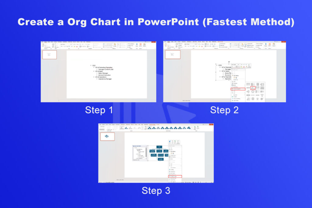
2. The Fastest SmartArt Trick Most People Do Not Know
Here is a lesser-known approach that saves even more time, and once I discovered it, I stopped building org charts any other way.
Step 1: Type Your Hierarchy as a Bulleted List
Click on an empty area of your slide and insert a text box. Type out your entire organization as a bulleted list. Use the Tab key to indent names that report to the person above them. For example:
Step 2: Convert the List to a SmartArt Org Chart
Select all the text you just typed. Right-click on it and choose Convert to SmartArt from the context menu. Select the Organization Chart layout from the Hierarchy group.
PowerPoint will instantly convert your bulleted list into a fully formatted org chart, with all the hierarchy levels already correct. This method is dramatically faster when you have a large organization to map out.
Step 3: Optionally Convert to Shapes
Once your SmartArt looks the way you want it, you can right-click the entire graphic and select Convert to Shapes. This breaks the SmartArt into individual shapes and connectors that you can move and edit freely. Just keep in mind that once you convert, you lose the automatic layout adjustments that SmartArt provides.
3. How to Use a PowerPoint Org Chart Template
If you want a head start with professional-looking formatting, PowerPoint’s built-in templates are worth using.
Step 1: Search for Org Chart Templates
From the PowerPoint home screen, click New and type “org chart” in the search bar for online templates and themes. Press Enter and browse the results.
Step 2: Choose and Customize a Template
Click on any template that catches your eye. Do not worry too much about the colors, because you can change those in seconds. Click Create to open it as a new presentation.
Replace the placeholder text in each shape with your own names, titles, and departments. If the template does not have enough shapes for your organization, use the Add Shape options described in Method 1 above.
Step 3: Update the Design
Click the Design tab to apply a different theme if the template’s visual style does not match your branding. You can also go to the SmartArt Design tab and click Change Colors to apply a preset color scheme.

How to Customize Your Org Chart in PowerPoint
Once the structure is in place, the real polish comes from formatting. Here is how I approach it.
Change Colors to Match Your Brand
Click on the SmartArt graphic, then go to the SmartArt Design tab and click Change Colors. You will see color palettes grouped by style. Choose one that fits your brand or use the Format tab to apply custom fill colors to individual shapes.
To change the color of a single box, right-click it and choose Format Shape. You can adjust the fill color, border color, and border weight here.
Add Photos to Your Org Chart
If you want a more personalized org chart that includes employee photos, go to the SmartArt gallery and choose Circle Picture Hierarchy from the Hierarchy group instead of the standard Organization Chart. This layout includes circular photo placeholders alongside each name. Click the photo icon in any placeholder, browse for the image file, and click Insert.
Make sure all photos are cropped consistently for a clean, professional result.
Resize and Align Shapes
You can resize the entire SmartArt graphic by clicking and dragging its corners. To resize individual shapes within the SmartArt, click on a specific shape and use the Size group in the Format tab to set exact dimensions.
Use the Arrange group in the Format tab to align shapes evenly across rows or columns.
Use Color Coding for Departments
One of the smartest ways to make a large org chart readable at a glance is to color-code by department. For example, use blue for the marketing team, green for sales, and orange for operations. To do this, select all shapes in one department (hold Ctrl and click each one), right-click, and choose Format Shape to apply a fill color.
Tips for Making a Professional Org Chart in PowerPoint
After building dozens of org charts over the years, I have learned a few things that separate a clean, readable chart from a cluttered one.
- Start from the top and work down. Always begin with the CEO or highest-ranking person and build downward. This keeps the hierarchy intuitive and avoids confusing gaps in reporting lines.
- Use consistent shapes. If rectangles represent employees, use rectangles throughout. Do not mix shapes unless you are using a specific shape to represent a different role type, like a diamond for contractors or an oval for advisory roles.
- Keep text short. Each box should contain a name and a title, nothing more. Long descriptions inside shapes make the chart cluttered and hard to read from a distance.
- Limit your chart to one screen. If your org chart requires scrolling or zooming to read, it is too large for a single slide. Consider breaking it into department-level charts on separate slides, with a summary chart on the first slide.
- Use consistent font sizes. The CEO box might have slightly larger text than subordinate levels, but every person at the same level should have the same font size. This keeps the visual hierarchy clear.
Common Mistakes to Avoid While Creating Org Chart in PPT
I see these mistakes come up again and again when people build org charts in PowerPoint.
- Forgetting to update the chart when the team changes. An outdated org chart is worse than no org chart at all because it misleads people. Set a calendar reminder to review your org chart every quarter.
- Using too many hierarchy levels on one slide. PowerPoint can technically accommodate very deep hierarchies, but readability falls apart fast once you go beyond four or five levels. Use multiple slides if necessary.
- Not grouping the SmartArt before exporting. If you are sharing the file with someone who has a different version of PowerPoint, your formatting might shift. Group the SmartArt (or convert it to shapes) before sharing to lock the layout in place.
- Ignoring accessibility. Add alt text to your org chart by right-clicking the graphic and choosing Edit Alt Text. This makes your presentation accessible to screen reader users.
Limitations of Building Org Charts in PowerPoint
PowerPoint is excellent for creating org charts quickly, but I want to be upfront about where it falls short.
Real-time collaboration is awkward in PowerPoint. If two people are editing the same file simultaneously, version conflicts happen easily. For teams that need multiple people updating an org chart regularly, a dedicated tool may serve you better.
Static charts are also a limitation. PowerPoint org charts do not update automatically when your employee data changes. Every edit is manual. If you manage a large or fast-changing organization, you will spend more time maintaining the chart than building it.
For most small to mid-sized teams, though, PowerPoint handles the job just fine.
3 Readymade Org Chart PowerPoint Templates
Building an org chart from scratch is great if you enjoy the process, but sometimes you just need something that looks polished right out of the box. That is exactly why I put together this list of my favorite org chart PowerPoint templates. Each one is fully editable, works with all recent versions of PowerPoint, and gives you a professional starting point you can customize in minutes.
1. Free Team Structure Org Chart Template

This Team Structure PowerPoint presentation template showcases a clean hierarchical layout with leadership at the top and team members organized below using connecting lines and arrows. Color segmentation distinguishes departments, while structured content areas highlight names, roles, and images. A dedicated section supports NPS scale insights for performance context. The modern, balanced design ensures clarity and professionalism. Fully editable in both PowerPoint and Google Slides, it enables easy customization for corporate team presentations and organizational overviews.
2. Editable Organizational Chart Template
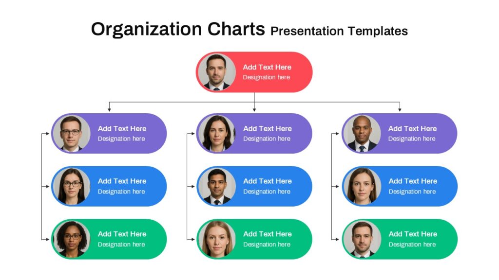
This editable Organization Charts features a structured hierarchical layout with a top executive role connected to multiple team levels below. The design uses clear reporting lines and distinct color segmentation—red for leadership, purple and blue for mid-level management, and green for supporting roles—to enhance visual clarity. Rounded content blocks include profile images, names, and designations in organized sections. The layout reflects a clean, modern business style and is fully editable in both PowerPoint and Google Slides for seamless customization.
3. Free Circular Org Chart Template
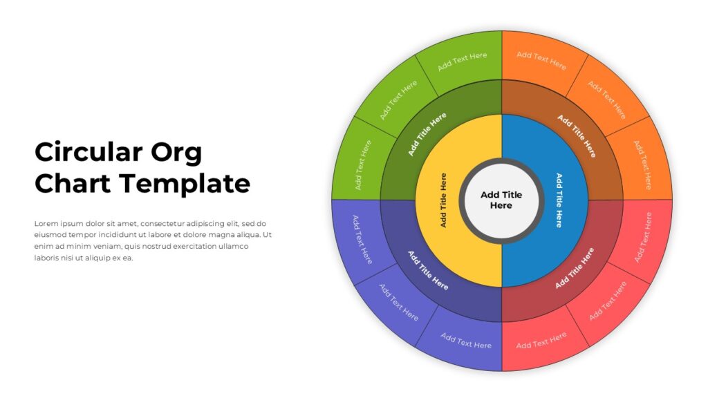
This Circular Org Chart Template presentation slide features a multi-layered circular layout designed to visualize hierarchical structures in a clear and engaging way. The slide includes concentric rings with distinct color segmentation, allowing teams, departments, or roles to be organized logically from the center outward. Each ring contains structured content areas with editable text placeholders for titles and descriptions. The balanced design enhances readability and flow, and the slide is fully editable in both PowerPoint and Google Slides for seamless customization.
Final Thoughts
Creating an org chart in PowerPoint is one of those tasks that sounds more complicated than it actually is. With SmartArt, you can go from a blank slide to a fully structured hierarchy in under ten minutes. The fastest approach I know is to type your hierarchy as a bulleted list first, then convert it to SmartArt in a single click. That alone cuts the build time in half compared to adding shapes one by one.
Start with the method that fits your timeline and your organization’s complexity. Use templates if you want a polished look right away. And remember, the best org chart is not the most elaborate one. It is the one that your team can actually read and use.
Now open PowerPoint and give it a try. You will have a clean, professional org chart ready before your next meeting.
Frequently Asked Questions
A: Yes. If you have a Microsoft 365 subscription or a standalone copy of PowerPoint, all the tools you need, including SmartArt and templates, are included at no extra cost.
A: Convert your SmartArt to shapes first (right-click, Convert to Shapes). Then draw a new connector between the two relevant shapes using Insert > Shapes > Lines. Right-click the line and choose Format Shape to change the line style to dashed or dotted.
A: Yes. Right-click on the SmartArt graphic or the entire slide and choose Save as Picture to export it as a PNG, JPEG, or other image format. You can also export the entire file as a PDF via File > Export > Create PDF/XPS.
A: There is no strict limit, but readability starts to suffer around 20 to 30 names on a single slide. For larger organizations, break the chart into multiple slides organized by department or division.
Related Articles
 February 26th, 2026
How to Use PowerPoint: The Complete Step-by-Step Guide for Beginners and Beyond
PowerPoint Tutorials- March 26th, 2026
PowerPoint Morph Transition: The Ultimate Guide to Using Morph in PowerPoint Presentations
PowerPoint Tutorials - February 27th, 2026
How to Convert PowerPoint to Google Slides: 4 Easy Methods (Step-by-Step)
PowerPoint Tutorials