- What Is a Professional Timeline in PowerPoint Presentations?
- Why a PowerPoint Timeline Belongs in Your Presentation Toolkit
- Method 1: Make a Timeline in PowerPoint Using SmartArt
- Method 2: Create a Timeline in PowerPoint – Manually from Scratch
- Method 3: Create Timelines in PowerPoint Using a Pre-Built Template
- How to Animate Your Chronological Graphic in PowerPoint
- Best Practices Every Presenter Should Know Before They Make a Timeline
- Mistakes That Weaken a Timeline Slide and How to Avoid Them
- How to Create Timelines and Update Your Graphic When Dates Change
- Examples of Timeline Templates to create your timeline
- Final Thoughts
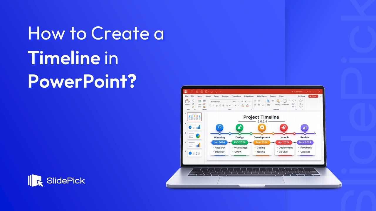
How to Create a Timeline in PowerPoint: Free PowerPoint Timeline Templates and Google Slides

- What Is a Professional Timeline in PowerPoint Presentations?
- Why a PowerPoint Timeline Belongs in Your Presentation Toolkit
- Method 1: Make a Timeline in PowerPoint Using SmartArt
- Method 2: Create a Timeline in PowerPoint – Manually from Scratch
- Method 3: Create Timelines in PowerPoint Using a Pre-Built Template
- How to Animate Your Chronological Graphic in PowerPoint
- Best Practices Every Presenter Should Know Before They Make a Timeline
- Mistakes That Weaken a Timeline Slide and How to Avoid Them
- How to Create Timelines and Update Your Graphic When Dates Change
- Examples of Timeline Templates to create your timeline
- Final Thoughts

If you have ever sat down to build a timeline in PowerPoint and immediately felt overwhelmed by options, you are in good company. Most people open Microsoft PowerPoint, stare at a blank slide, and spend the next twenty minutes debating whether to use SmartArt, draw everything by hand, or grab a ready-made template. I have been there, and I wrote this guide specifically to cut through that confusion.
A well-crafted timeline graphic does something a wall of text cannot: it shows your audience exactly where events fall in relation to each other without requiring them to do the mental work themselves. Whether you are creating a project roadmap, a company history for an investor deck, or a school history assignment, this type of visual gives your PowerPoint presentation a professional edge that sticks in people’s minds long after the meeting ends.
By the end of this guide, you will know three different ways to build one of these visuals from scratch, how to choose the right approach for your situation, and how to keep everything looking polished with minimal effort. Let me walk you through each method and learn how to create a timeline step by step.
What Is a Professional Timeline in PowerPoint Presentations?

A timeline in PowerPoint is a visual graphic that arranges events, milestones, or tasks in chronological order along a horizontal or vertical axis. Instead of describing a sequence through paragraphs or bullet points, it condenses that information into a single, scannable visual that your audience can absorb in seconds.
In practical terms, every timeline graphic has three core components. First, there is the baseline, the horizontal or vertical spine that represents the passage of time from one point to another. Second, there are the milestone markers, the shapes or icons placed along that line to indicate when each event occurs. Third, there are the text labels, the dates, and descriptions attached to each marker that explain what happened and when.
What sets this kind of visual apart from a simple list is the spatial dimension it adds. When your audience can see that two milestones sit close together on the line, they immediately understand that those events happened in quick succession. When two markers are far apart, they perceive a longer gap between them. That spatial encoding happens instantly and without any explanation from the presenter. It is one of the most efficient forms of information delivery in any presentation tool.
Timelines come in several forms depending on the content and context. A project version shows phases and deadlines for a specific initiative. A historical one walks audiences through past events in sequence. A product roadmap visualizes planned features and release dates. A company history version highlights key milestones from founding to the present. Each type follows the same fundamental structure but adapts the content and visual emphasis to suit the audience’s needs.
The reason I always recommend adding this kind of visual to complex presentations is straightforward: it gives your audience a mental map of the entire story before you walk them through the details. Once they have that map, every subsequent piece of information falls into place more clearly because they already know where it fits in the bigger picture.
Why a PowerPoint Timeline Belongs in Your Presentation Toolkit
Audiences process visual information faster than text. A PowerPoint timeline hands them the full chronological picture in a single glance, which is why project managers, educators, marketing teams, and startup founders all lean on this format regularly.
Project managers use it to map out phases and deadlines at a level of detail that bullet points cannot match. Educators walk students through historical events without turning a lesson into a reading exercise. Marketing teams plot campaign calendars visually so stakeholders can spot overlaps instantly. Founders include it in pitch decks to show traction and momentum without writing a paragraph of backstory.
The timeline format works because it converts abstract dates into spatial relationships. Earlier events sit to the left, later ones to the right, and the distance between them communicates pace and priority before anyone reads a single word. If there is one visual format worth learning well in PowerPoint, the timeline is it.
Pro Tip: Before you open PowerPoint, jot down every milestone on paper and decide on a rough order. Getting that thinking done first makes every method below significantly faster to execute.
Method 1: Make a Timeline in PowerPoint Using SmartArt
The quickest way to create a basic timeline in PowerPoint is through SmartArt, the built-in graphic tool that handles spacing and layout automatically. This method is my first recommendation for anyone who needs a clean, professional result in under ten minutes.
Step 1: Set Up a Blank Slide
Open your file and navigate to the page where you want this graphic to live. If you are starting fresh, go to the Home tab, click Layout, and select Blank. A blank layout gives you the most usable canvas space and removes placeholder text boxes that would otherwise get in the way.

Step 2: Open SmartArt from the PowerPoint Ribbon
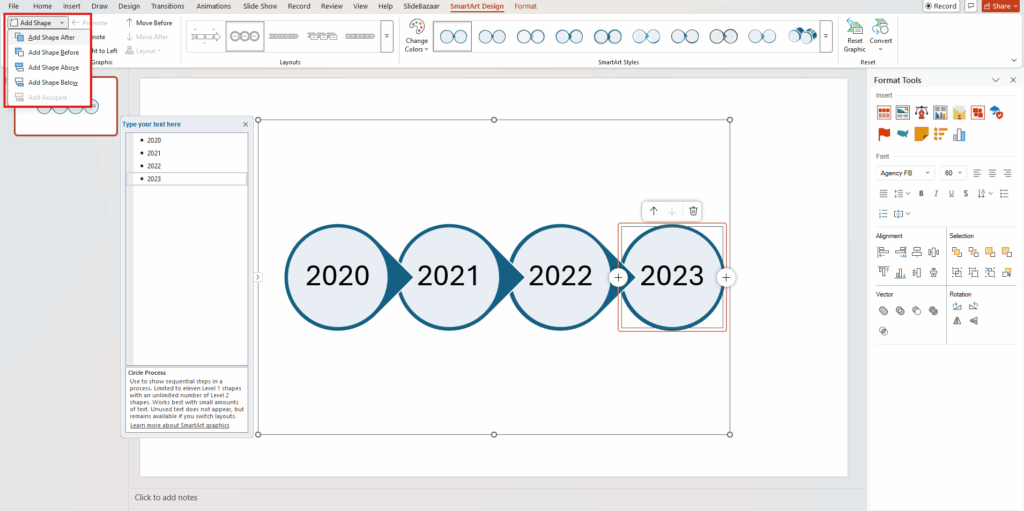
Click the Insert tab at the top of the screen. In the Illustrations group, click SmartArt. A dialog box will open showing every built-in graphic category. This is the starting point for every pre-built chronological visual that the application offers.

Step 3: Pick a Timeline Layout That Fits Your Content
In the left panel of the SmartArt dialog, select Process. This category contains the best options for chronological visuals. Focus on two specifically.
• Basic Timeline: A clean horizontal arrow with milestone markers. This is the right choice when your labels are short, and the sequence is the main story. I reach for it whenever I need something fast and uncluttered.
• Circle Accent Timeline: Each milestone gets a circular marker along a horizontal bar. This is slightly more refined visually and works well when presenting to clients or senior stakeholders who expect a polished look. It is also a strong choice when you want each milestone to feel equally important rather than letting the arrow dominate the composition.
Double-click your preferred option to drop it onto your canvas.

Step 4: Populate Your Milestones with the Text Pane
Once the SmartArt graphic is on the page, placeholder labels reading [Text] will appear at each marker. The fastest way to fill them in is through the Text Pane, a sidebar that lists every label in a simple outline so you can edit them all in one view. To open it, click the small arrow on the left edge of the SmartArt graphic, or go to SmartArt Design and click Text Pane in the Create Graphic group. Type each milestone label or date on its own line and watch the graphic update as you go.

Step 5: Add or Remove Milestones
Default SmartArt graphics come with a preset number of markers. To add one, click the marker nearest to where the new entry should appear, go to SmartArt Design, click Add Shape, and choose Add Shape After or Add Shape Before. To remove one, click it and press Delete. The graphic adjusts spacing automatically, which is one of the biggest time-saving advantages of this approach.
Step 6: Apply a SmartArt Style and Save as a Reusable Timeline Template
With the graphic selected, go to the SmartArt Design tab. Click Change Colors to choose a scheme that matches your brand or presentation theme. Then open the Styles gallery and apply a visual treatment. A flat or subtle SmartArt style reads as modern and professional. Heavy three-dimensional effects tend to look dated and distract from the content.
Once you are happy with the result, consider saving the file as a PowerPoint timeline template for future use. Go to File, Save As, and choose the .pptx format. Every new presentation you build from that file will have the formatted graphic ready to customize, which makes it much faster to create timelines in PowerPoint on a recurring basis.

Pro Tip: After inserting your SmartArt, right-click it and choose Format Object to access border, shadow, and fill settings that go beyond what the SmartArt Design tab offers.
Method 2: Create a Timeline in PowerPoint – Manually from Scratch
When SmartArt feels too rigid, building everything by hand gives you complete creative control. I use this approach with Microsoft PowerPoint to create a timeline matching a specific brand identity precisely, or when I need a different timeline layout from what the built-in options provide, such as a vertical arrangement or an asymmetric design.
Step 1: Insert Line
Go to Insert, click Shapes, and under Lines choose the straight-line tool. Hold Shift while drawing to keep it perfectly horizontal across your PowerPoint slide. Leave a small margin on each side. Once placed, right-click the line, open Format Shape, and increase the line weight to 3 or 4 points so it reads clearly at any viewing distance. Change the color to suit your palette. This line is the visual spine of the entire composition.
Step 2: Add Markers for Each Event on the Slide
Go to Insert, click Shapes, and pick a circle or diamond from Basic Shapes. Draw a small shape and place it directly on the line at each event point. Hold Shift while drawing to get a perfect circle every time. Right-click to format the fill and border colors so they match the baseline.
To keep all markers the same size, draw one, set its exact dimensions in the Format Shape panel, such as 0.4 x 0.4 inches, then copy and paste it for every additional entry. Consistent sizing is one of those small details that separates an obviously amateur layout from something that looks like it was designed intentionally.
Step 3: Decide Between a Horizontal or Vertical Timeline
One of the real advantages of building manually is that you can go in any direction. A horizontal arrangement suits project roadmaps and event sequences where left-to-right progression feels natural. A vertical timeline works better for step-by-step processes, long lists of milestones, or presentations designed to be read on a mobile screen. To build it vertically, draw the baseline from top to bottom, position markers along the vertical axis, and place text boxes to the left or right of each marker. This orientation is something SmartArt does not offer, and audiences often find it refreshing precisely because it breaks the standard horizontal mold.
Step 4: Add Labels Above and Below the Line
Go to Insert and select Text Box. Draw a box near each marker and type the date and description. For horizontal arrangements, alternate labels above and below the line: odd-numbered events above, even-numbered events below. This prevents overlap when milestones are close together and makes the entire composition easier to scan. Keep fonts consistent across all labels. Use bold for dates so they register faster than the surrounding description text. A size range of 10 to 12 points for descriptions and 11 to 13 points for dates works well at standard presentation dimensions.
Step 5: Align and Distribute Everything Precisely
Select all markers, go to the Home tab, click Arrange, then Align, and use Align Center to lock all markers perfectly to the baseline. Then use Distribute Horizontally to space them evenly. These two tools take about ten seconds and make an enormous visible difference. Trying to do the same thing by eye takes much longer and almost never produces consistent results.
Pro Tip: Select everything on the composition and group it so it behaves as a single object. This prevents accidentally nudging individual pieces out of alignment every time you move or resize the group.
Step 6: Use Connector Lines to Insert a Cleaner Timeline in PowerPoint
When labels float above or below the baseline without a visual link to their corresponding marker, audiences have to guess which label belongs where. Thin dashed connector lines from each label to its marker solve this immediately. Go to Insert, click Shapes, and draw a short vertical line for each connection. Format them as dashed in a lighter version of your main color. This is the kind of finishing detail that makes a manually built composition look deliberate rather than assembled. It matters especially when you create a project timeline that multiple stakeholders will review and question.
For anyone who wants to insert a timeline in PowerPoint presentations that already exist, this manual method is the most flexible because every element is an independent shape that can be dropped into any existing file without disturbing the surrounding layout.
Method 3: Create Timelines in PowerPoint Using a Pre-Built Template
If speed is the priority and you want a polished result without any design work, starting from a ready-made template is the most efficient path. Microsoft PowerPoint includes several options in its online library.
Open PowerPoint and type timeline in the search bar on the start screen. You will find designs covering project roadmaps, history presentations, product launches, and more. Each one comes with a pre-set visual structure, color scheme, and font selection already in place. Your only job is to replace the placeholder text with your own content.
The trade-off with a template is structural rigidity. If your content has a different number of milestones than the design was built for, reshaping the layout can sometimes take more effort than building from scratch. I recommend using a powerpoint template for one-off presentations where time is short. For anything you will revise and maintain regularly, SmartArt or a manual build gives you more flexibility in the long run.
Pro Tip: Once you have customized a downloaded design to fit your brand, save your own branded version as a .potx file. Every future presentation can start from that branded baseline instead of a generic one.
How to Animate Your Chronological Graphic in PowerPoint
Static graphics work perfectly for handouts and PDF exports. In a live presentation, however, revealing each milestone individually is one of the most underused powerpoint features available. Done well, it keeps your audience focused on each event as you discuss it rather than reading ahead.
1. Select your graphic, or the grouped shapes if you built it manually.
2. Go to the Animations tab.
3. Click Add Animation. Choose Fade or Wipe for a clean entrance. Avoid Bounce, Spin, or anything flashy that pulls attention away from the content.
4. Open the Animation Pane to review the sequence and reorder anything that needs adjustment.
5. Set each animation to On Click for presenter-controlled pacing, or After Previous with a 0.5-second delay for an automatic flow.
For SmartArt graphics, click on the object, go to Effect Options in the Animations tab, and select One by One. This reveals each marker individually and is ideal for walking an audience through a sequence step by step.
Best Practices Every Presenter Should Know Before They Make a Timeline
After building more of these than I can count, I have settled on a short list of principles that consistently produce clean, professional results, regardless of which method you use.
- Cap it at eight milestones per view. Beyond that, labels become too small to read comfortably, and the composition starts to feel cluttered. If you have more events, break them across two sections organized by phase or time period.
- Pick one orientation and stay with it. Mixing horizontal and vertical arrangements across different pages creates visual inconsistency that distracts from your content.
- Use three colors at most. One for the primary line and markers, one for text, and one accent for the most important milestones. More than three, and the composition starts competing with itself.
- Always include dates. A visual chronology without dates is just a list of events. Even a year adds the temporal anchor your audience needs to understand the story you are telling.
- Left-align all text boxes. Centered text in small boxes creates awkward line breaks. Left-aligned text reads more naturally and looks more deliberate.
- Test readability at 50 percent zoom. Zoom out before you finalize anything. If any label is hard to read at half scale, either enlarge the font or reduce the number of milestones shown.
Mistakes That Weaken a Timeline Slide and How to Avoid Them
Whether you are making your first chronological graphic or your fiftieth, the same handful of mistakes come up repeatedly. Recognizing them ahead of time saves a lot of rework.
- Trying to show everything at once. When you create a timeline in PPT with twenty events in a single view, nothing is readable, and nothing stands out. Be selective. A focused, readable layout is always more persuasive than a comprehensive but illegible one.
- No visual hierarchy. If every label is the same size and color, there is no way for the audience to tell which milestones matter most. Use bold, size, or a contrasting color to signal importance.
- Irregular spacing without explanation. Uneven gaps between markers imply unequal time intervals even when that is not the case. Use equal spacing unless you specifically intend to represent real-time proportions.
- Weak color contrast. Light text on a light background, or dark text on a dark background, makes the content unreadable on a projector. Always verify contrast before the presentation.
- Missing connector lines. When labels float near the baseline with no visual link to their corresponding marker, audiences waste time matching labels to points. Connector lines solve this in seconds.
How to Create Timelines and Update Your Graphic When Dates Change
Project dates shift. Scopes evolve. Knowing how to keep your chronological graphic current is just as important as knowing how to build it the first time.
- For SmartArt graphics, updates are fast. Click on any label and edit it directly, or open the Text Pane to review and revise all content from a single sidebar. Adding a new milestone takes one click in the SmartArt Design tab. The application repositions everything automatically, so you do not have to touch individual shapes.
- For manually built layouts, ungroup the shapes first, make your changes, then regroup. After inserting a new marker, use Align and Distribute to reset the spacing. Never try to eyeball the positioning.
- For any customized template you have saved previously, keep a clean master copy that you update with each structural change. Treating your .potx file as a living document rather than a one-time creation is the habit that makes future builds faster. When you need to build a timeline in powerpoint again for the same project or team, you will have a ready-made starting point rather than an empty file.
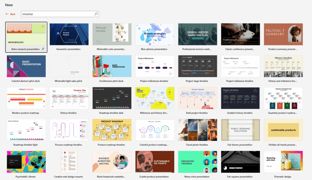
Examples of Timeline Templates to create your timeline
If you would rather start from a professionally designed layout than build one from scratch, SlidePick offers a solid collection of ready-made designs compatible with both PowerPoint and Google Slides. I will list five options from our library, each suited to a different use case. You can browse the full collection of editable timeline templates and download the one that fits your needs best from the timeline templates available.
1. Swimlane Timeline Template
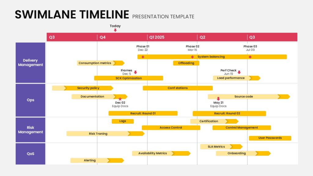
This Swimlane Timeline presentation slide illustrates a structured project roadmap organized into multiple horizontal swimlanes for Delivery Management, Ops, Risk Management, and QoS. The layout features a clear quarterly timeline across the top with phase markers, milestones, and progress indicators. Color-segmented bars highlight tasks such as optimization, security policies, certifications, and onboarding. Each lane contains organized content areas that display project activities and deadlines. The design is modern, easy to read, and fully editable in both PowerPoint and Google Slides for business planning and project tracking.
2. Animated Zig Zag Timeline Template
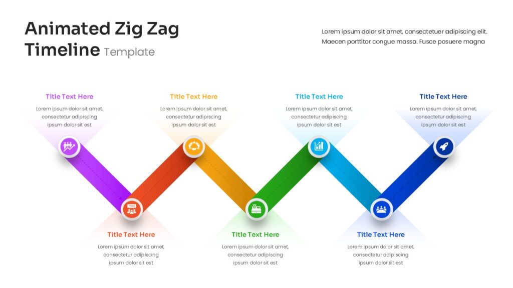
This Animated Zig Zag Timeline presentation slide displays a dynamic zigzag layout that highlights sequential stages of a process or project timeline. The design features connected colored segments—purple, orange, green, blue, and dark blue, each marked with circular icons representing milestones. Content areas appear above and below each point to describe key steps, making the flow easy to follow. The modern layout emphasizes progression and storytelling across the timeline and is fully editable in both PowerPoint and Google Slides for professional presentations.
3. Multi Year Timeline Slide Template
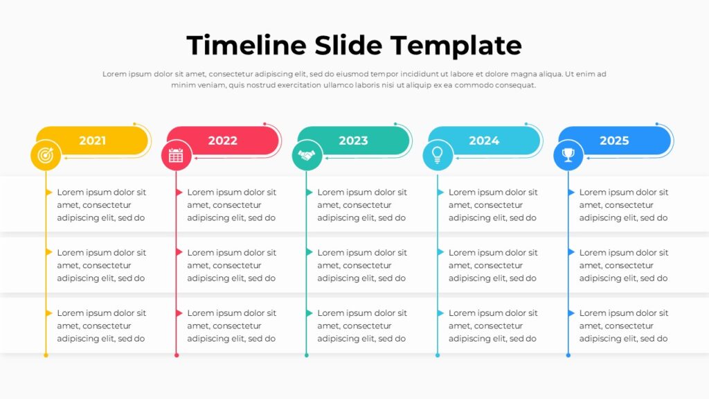
This Timeline Slide Template presentation slide presents a clean horizontal roadmap illustrating key milestones across five years from 2021 to 2025. Each year is highlighted with a colored circular marker connected along a horizontal timeline. Beneath each marker, structured vertical content areas display bullet points for describing goals, updates, or achievements. The layout uses clear color segmentation to separate each timeline stage while maintaining visual flow and readability. The modern, business-friendly design is fully editable in both PowerPoint and Google Slides for presenting long-term plans or project progress.
4. Arrow Timeline Template
This Arrow Timeline presentation slide illustrates a clear step-by-step process using four horizontal arrows arranged in separate rows. Each arrow is color-coded—blue, dark blue, purple, and red—and points toward a text area labeled “Your Text Here,” where supporting descriptions explain each stage. The layout includes aligned content sections that make it easy to present workflows, phases, or sequential milestones. The modern design emphasizes clarity and visual flow and is fully editable in both PowerPoint and Google Slides for professional business presentations.
5. Project Timeline Template with Milestones & Stages
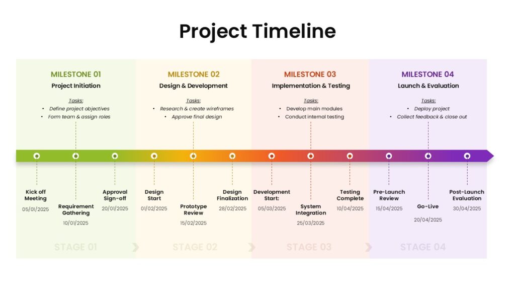
This Project Timeline presentation slide presents a structured roadmap divided into four milestone phases, each highlighted with distinct color segments. The layout features a horizontal progression line with milestone markers such as project kickoff, design and development, implementation and testing, and launch and scale. Below the timeline, organized content areas list supporting tasks and activities aligned with each phase. The design emphasizes clarity, structured planning, and easy visual tracking. It is fully editable in both PowerPoint and Google Slides, making it suitable for professional project management presentations.
Final Thoughts
Now you have three clear paths forward. SmartArt is the fastest route to a clean, presentable powerpoint timeline. Building manually gives you the freedom to produce something unique when your content demands it. Starting from a ready-made design is the right call when speed matters more than customization.
The most important thing I can tell you is that a great chronological graphic starts before you open any application. Decide which milestones matter, settle on a rough layout, and choose the method that fits the time you have. Once that thinking is done, the actual building is straightforward.
Whether you need to create a timeline for a client pitch, build one for a class project, or construct a company roadmap you will update every quarter, the right approach is always the one that balances quality with the time available. Use this guide as your reference each time you sit down to build one, and you will always know exactly where to begin.
Related Articles
 March 10th, 2026
80+ Creative and Fun PowerPoint Night Ideas: Topics for Your Next PowerPoint Night
PowerPoint Tutorials- February 26th, 2026
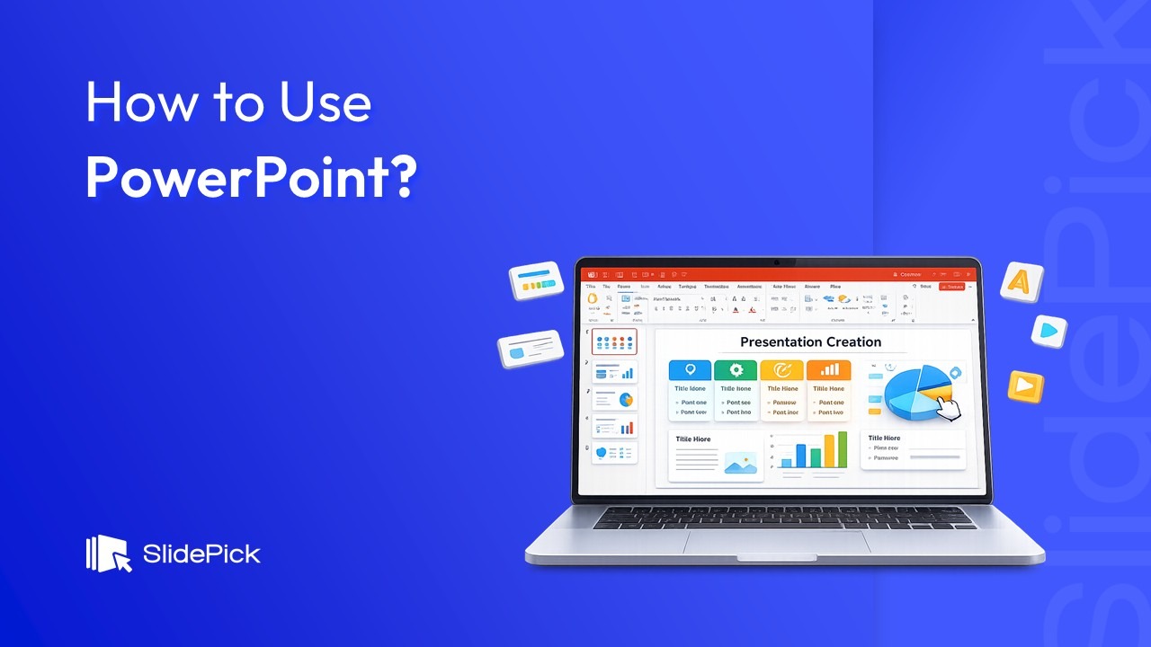
How to Use PowerPoint: The Complete Step-by-Step Guide for Beginners and Beyond
PowerPoint Tutorials - March 2nd, 2026
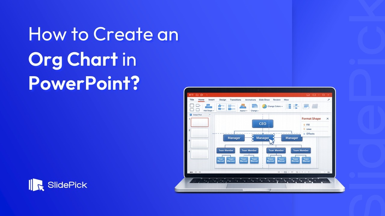
How to Create an Org Chart in PowerPoint (Easy Guide for 2026)
PowerPoint Tutorials