- Why Good Design Matters in Google Slides
- Core Principles That Make Google Slides Look Good
- Consistent Color Schemes and Typography for Google Slides
- Animations, Transitions, and Multimedia in Google Slides
- Collaboration and Audience Interaction in Google Slides
- Google Slides Design Trends and Inspiration (2026)
- Animation and Transition Trends That Feel Current
- Choosing the Right Design Trend for Your Presentation
- Smart Use of Google Slides Features
- Step-by-Step Checklist to Improve Any Slide Deck
- 5 Google Slides Templates for Business Presentations
- Final Tips to Make Your Google Slides Stand Out

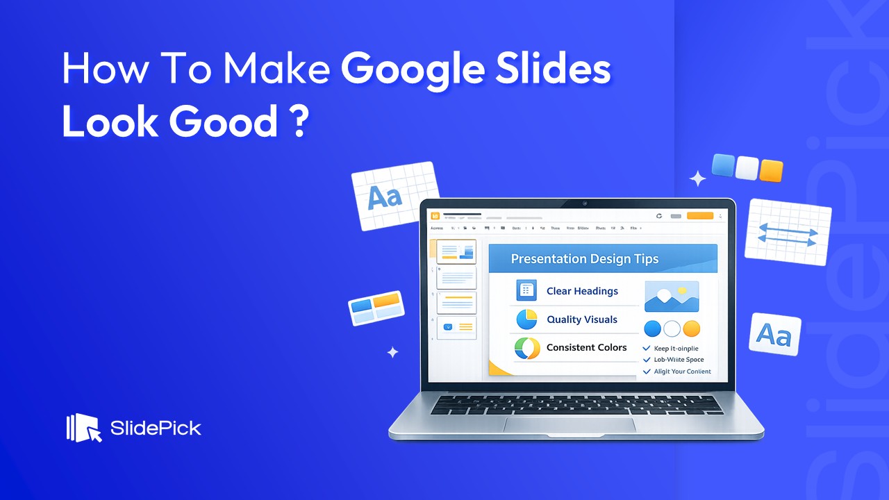
Creating a visually appealing presentation is no longer optional. Whether you’re pitching a business idea, teaching a class, or presenting a report, people judge your message by how your slides look. The good news is that you don’t need to be a designer to create professional-looking slides. With the right principles, tools, and templates, anyone can learn how to make Google Slides look good.
This guide is based on common patterns found across top-ranking articles for this keyword. It focuses on clarity, consistency, and practical steps you can apply immediately.
Why Good Design Matters in Google Slides
A well-designed slide deck does three important things:
1. Improves understanding – Clear layouts and visuals help your audience grasp ideas faster.
2. Builds credibility – Professional slides make you look more prepared and trustworthy.
3. Keeps attention – Clean, engaging slides reduce boredom and distraction.
Most poor presentations fail not because of bad content, but because of cluttered layouts, inconsistent styling, and too much text.
Core Principles That Make Google Slides Look Good
Before touching any design tools, focus on these fundamentals:
1. One Idea per Slide
Each slide should communicate a single clear message. If your slide title cannot summarise the slide in one sentence, it’s trying to do too much. This approach keeps your presentation focused and easy to follow.
2. Consistent Layout and Style
Consistency is the foundation of good slide design. Use the same:
• Font styles for headings and body text
• Color palette throughout the deck
• Alignment and spacing patterns
Google Slides’ Theme Builder helps you control this from the start so every slide looks unified.
3. Use Whitespace Intentionally
Empty space is not wasted space. Whitespace helps separate ideas, improves readability, and draws attention to what matters most. Avoid filling every corner of the slide.
4. Visuals Over Text
Slides are visual support, not a script. Replace long paragraphs with:
• Short phrases
• Icons
• Images
• Charts and diagrams
If something needs a detailed explanation, say it verbally instead of putting it on the slide.
5. Fonts, Colors, and Typography Tips
Typography plays a huge role in how polished your slides feel:
• Use only 1–2 fonts: one for headings, one for body text.
• Choose readable fonts: Sans-serif fonts like Inter, Roboto, or Open Sans work well for screens.
• Create hierarchy: Titles should be clearly larger than body text.
• Limit colors: Stick to 2–3 main colors plus neutral tones.
• A simple color rule: one primary color, one accent color, and plenty of white or light gray space.
Consistent Color Schemes and Typography for Google Slides
Maintaining consistent color and typography across all slides dramatically improves how professional and polished your deck looks. Here’s how to do it right:
Build a Brand-Consistent Color Palette
• Stick to 2–3 brand colors across all slides for visual harmony.
• Use corporate brand colors if presenting on behalf of a business.
• Add drop shadows and contrast strategically to make key elements pop.
• Avoid clashing color combinations – use tools like Coolors or Adobe Color to build a palette.
• Apply a custom Google Slides theme to lock in your palette across the entire deck.
• Use consistent image backgrounds or keep them minimal to avoid distraction.
A clear content hierarchy guides your audience’s eye through each slide:
Typography Hierarchy That Works
• H1 (Slide Title): Large, bold, and attention-grabbing – 36–44pt
• H2 (Section Header): Medium weight – 28–32pt
• Body text: Clean, readable – 18–22pt
• Captions/footnotes: Small and subtle – 14–16pt
Animations, Transitions, and Multimedia in Google Slides
One of the most underused ways to make Google Slides look good is thoughtful use of animations, transitions, and multimedia. When applied correctly, these elements add interest and emphasis without overwhelming the audience.
How to Add Animations in Google Slides
• Select any text box, image, or element and click Insert > Animation.
• Choose entrance effects like Fade in, Dissolve, or Fly in for clean transitions.
• Use animated images (GIFs) to add movement without building complex animations.
• Trigger animations on click or automatically – choose based on your presentation flow.
• Avoid overusing animations. Stick to 1–2 animation types per deck for consistency.
How to Add Transitions Between Slides
• Go to Slide > Transition to open the transition panel.
• Choose subtle options like Dissolve or Fade – these look polished in most settings.
• Adjust transition speed to match the pace of your presentation.
• Apply the same transition to all slides for a cohesive look (click ‘Apply to all slides’).
Add Music and Video to Google Slides
• Insert > Audio: Add background music from Google Drive to autoplay during your presentation.
• Insert > Video: Embed YouTube videos or upload your own for rich, multimedia slides.
• Use video to replace long explanatory slides – a 30-second clip often beats a wall of text.
• Always test audio and video before presenting to avoid technical issues.
Cool Visual Effects You Can Try in Google Slides
• Drop shadows: Add depth to text boxes and images via Format Options > Drop Shadow.
• Neon text effects: Use dark backgrounds with bright-colored text for a modern look.
• Image masking with shape masks: Use Format > Mask Image to crop images into creative shapes (circles, stars, etc.).
• 3D-style infographics: Use free Google Slides infographic templates for instant visual depth.
• Gradient backgrounds: Replace plain white with subtle gradients for a more polished feel.
Collaboration and Audience Interaction in Google Slides
Google Slides is built for teamwork and audience engagement. Here’s how to use its collaboration features to make your presentations more effective:
Real-Time Collaboration Tips
• Share your slides via the Share button – control edit, comment, or view access per person.
• Use the comments feature (Insert > Comment) to gather feedback on specific slides.
• Make quick edits in real-time while co-presenters review on their devices.
• Use version history (File > Version History) to track changes and revert if needed.
Engage Your Audience During the Presentation
• Enable Presenter View (View > Presenter View) to see your speaker notes while the audience sees the clean slides.
• Use the Q&A feature (Present > Audience Tools > Q&A) to let the audience submit live questions.
• Add audience polls using third-party integrations like Mentimeter or Slido.
• Include interactive elements like clickable table-of-contents slides for non-linear navigation.
• Improve accessibility: use high-contrast colors and descriptive alt text for images.
Google Slides Design Trends and Inspiration (2026)
Great presentation design isn’t static. Staying current with Google Slides presentation design trends is one of the fastest ways to make your deck look polished without extra effort. Here are the trends defining standout slides in 2026, with practical how-to steps and color inspiration for each.
1. Minimalism
Minimalism remains the dominant trend for good reason, it forces clarity. One idea per slide, generous whitespace, and zero decoration that doesn’t serve the message.
• Use a white (#FFFFFF) or light gray (#F8F8F8) background with a single bold headline per slide.
• Remove all borders, clip art, and decorative shapes that don’t carry meaning.
• Increase body font size to at least 22pt — large text on a clean slide is inherently minimal.
2. Dark Backgrounds
Deep navy, charcoal, or near-black backgrounds signal authority and modern sophistication — especially effective for tech, finance, and executive presentations.
• Use #1E1E2E (dark navy) or #1C1C1E (charcoal) rather than pure black — it looks more refined.
• Switch body text to off-white (#E8E8E8) and pick one vibrant accent: electric blue (#00D4FF), coral (#FF6B6B), or lime (#A8FF3E).
• Apply a monochromatic color scheme on dark slides — different shades of your accent for hierarchy.
3. Gradient Backgrounds
Gradient backgrounds add depth and movement without visual noise. They’re one of the easiest presentation design trends to implement and one of the most impactful.
• Right-click a slide > Change Background > Gradient. Set the angle to 135° for a diagonal flow.
• Color inspiration: #6A11CB → #2575FC (royal), #134E5E → #71B280 (botanical), #FC5C7D → #6A82FB (blush).
• Apply to your master slide in Theme Builder so it carries consistently across all slides.
4. Geometric Shapes and 3D Design Elements
Geometric design adds structure and visual energy. Pairing sharp 3D shapes with soft gradients gives slides a layered, architectural depth that flat layouts can’t match.
• Insert > Shape: add hexagons, parallelograms, or circles at 15–30% opacity as background accents.
• Use Format Options > Drop Shadow on shapes to create a 3D raised effect without external tools.
• Mask images into geometric shapes: select image > Format > Mask Image > choose a diamond or circle.
• Use SlidePick’s 3D Star Diagram template as a ready-made geometric visual centrepiece.
5. Muted Pastels
Muted pastel palettes — dusty rose, sage green, warm cream, soft lavender — feel calm, sophisticated, and contemporary. They’re ideal for wellness, education, and coaching presentations.
• Background color inspiration: dusty rose (#E8C5C0), sage (#B2C5B0), warm cream (#F5F0E8), soft lavender (#D5CCE8).
• Pair with dark charcoal text (#2D2D2D) — never pure black, which is too harsh against pastels.
• Build a monochromatic pastel color scheme using 3–4 shades of a single muted hue for cohesion.
6. Monochromatic Color Schemes
Using different shades, tints, and tones of one color creates a unified, effortlessly polished deck that’s impossible to clash. It’s one of the safest color approaches in professional presentation design.
• Monochromatic Blue: #003F7F (headings) → #4DA6FF (accents) → #CCE5FF (backgrounds).
• Monochromatic Green: #1B4332 → #74C69D → #D8F3DC.
• Monochromatic Purple: #3B0764 → #A78BFA → #EDE9FE.
• Set all shades in Slide > Edit Theme so every layout uses them automatically.
7. Google Fonts – Typography Trends for 2026
Font choice communicates personality before a word is read. These Google Font pairings are leading presentation design trends in 2026:
• Modern SaaS / tech: Plus Jakarta Sans (headings) + Inter (body).
• Premium / editorial: Playfair Display (headings) + Lato (body).
• Safe professional: Montserrat (headings) + Open Sans (body).
• Organic / nature: Cormorant Garamond (headings) + Jost (body).
• Access any Google Font: click the font dropdown in Slides > More fonts, search by name, and set your choice in Theme Builder.
8. Nature-Themed and Organic Design
Biophilic design — organic shapes, botanical motifs, and earthy palettes — is rising across all visual media. It makes presentations feel warm and memorable in a sea of corporate decks.
• Color inspiration: terracotta (#C4693A) + forest green (#4A7C59) + warm sand (#D4B896) + off-white (#FDF6EC).
• Replace sharp rectangular image frames with organic shape masks (leaf, arch, or blob shapes).
• Add free botanical SVG icons from unDraw.co or Flaticon as slide accents.
• Pair with nature-inspired serif Google Fonts like Cormorant Garamond or EB Garamond.
Animation and Transition Trends That Feel Current
Animation is a style statement. In 2026, restraint is the trend — subtle Fade In builds, staggered list reveals on click, and kinetic typography on key data points. Avoid spinning, bouncing, or 3D-rotation effects — these look dated. One animation style, applied consistently, is always better than variety.
Choosing the Right Design Trend for Your Presentation
• Corporate / investor pitch: Minimalism + dark backgrounds + monochromatic color scheme.
• Sales / marketing: Bold gradients + geometric shapes + strong typography.
• Education / wellness: Muted pastels + nature-themed design + organic Google Fonts.
• Tech / developer: Dark backgrounds + monospace fonts + subtle animation.
Pick one aesthetic, apply it with discipline across your deck, and let your content do the rest. SlidePick’s templates are built around these exact trends — each one is fully editable in Google Slides with no plugins required.
Smart Use of Google Slides Features
Google Slides has built-in tools that can dramatically improve design when used correctly.
Theme Builder
Set fonts, colors, logos, and default layouts once. This ensures every slide looks consistent without manual adjustments.
Custom Layouts
Create different layouts for common slide types:
• Title slide
• Text + image
• Two-column comparison
• Data or chart slide
Alignment Guides and Grouping
Always align text boxes and visuals using guides. Group related elements so they stay together when resizing or moving.
Charts and Diagrams
Use simple charts to highlight insights, not raw data. Remove unnecessary gridlines, labels, and colors that distract from the main point.
Insert Images Directly from Google Images
Use Insert > Image > Search the web to find and add images without leaving Google Slides. Filter by usage rights to stay copyright-safe.
Step-by-Step Checklist to Improve Any Slide Deck
If you want quick results, follow this process:
4. Open Theme Builder and define fonts and colors.
5. Rewrite slide titles so they clearly state the takeaway.
6. Cut text down to essentials (aim for under 30 words per slide).
7. Replace bullet lists with visuals or split them into multiple slides.
8. Align all elements and maintain equal spacing.
9. Use one accent color for highlights and key data points.
- Review slides in grid view to check visual flow.
- Remove anything that doesn’t support the main message.
- Add one animation or transition effect per section – keep it subtle.
- Test your slides on different screens to ensure readability.
5 Google Slides Templates for Business Presentations
Using professionally designed templates is one of the fastest ways to make Google Slides look good. Here are five template ideas you can include, each designed for a specific use case.
1. Sales Strategy Presentation Template
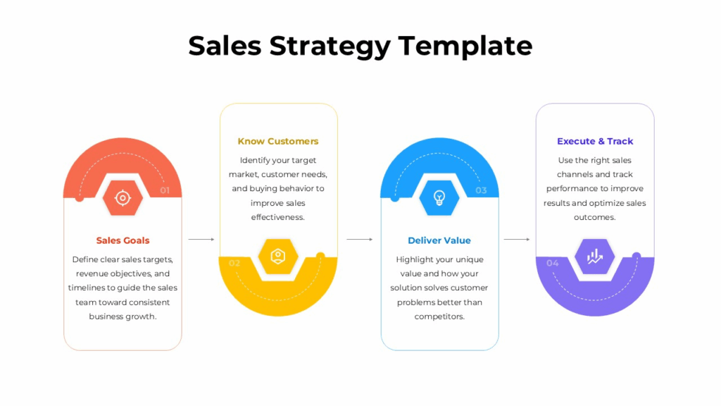
This template helps you break down your sales strategy into a clear process flow with visually structured sections. It’s ideal for:
- Presenting a full sales strategy to stakeholders
- Aligning teams on process stages
- Turning complex systems into simple visuals
Use its structured process diagrams and clean layouts to reduce complexity and enhance clarity.
2. Sales Pipeline Stages Process Flow Template
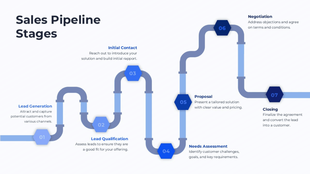
Perfect for sales and marketing presentations, this template maps every stage of your pipeline with clear, step-by-step slides. It’s great when you need to:
- Explain pipeline stages
- Visualize progression from lead to close
- Track performance or funnel conversion
Its clean flow visuals and consistent structure make slides easy to follow and professional looking.
3. 3D Star Diagram Infographic
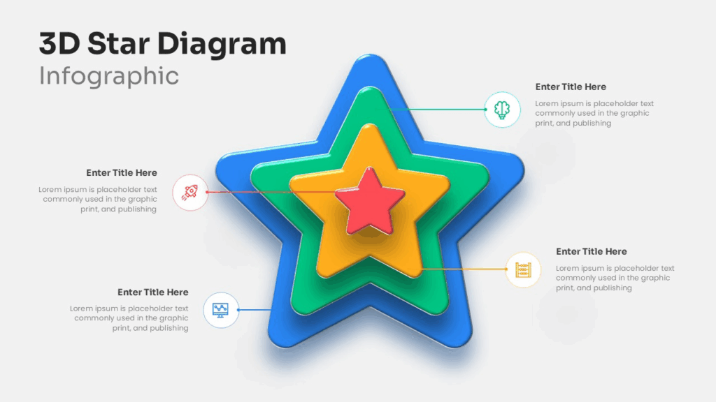
If your slide needs a standout visual centerpiece, this 3D star infographic template delivers. It’s best for:
- Highlighting core features or priorities
- Visual summaries of multi-facet ideas
- Presenting for executive audiences
Unlike flat bullet points, this dynamic graphic keeps attention and makes abstract concepts visually concrete.
4. WOOP Goal Setting Model
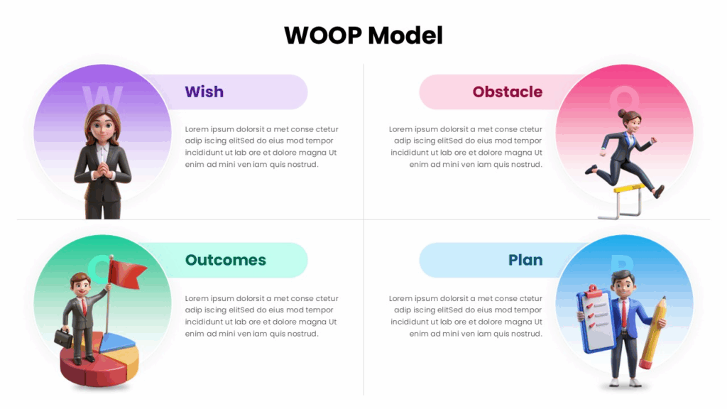
Use this template to guide your audience through the WOOP framework (Wish, Outcome, Obstacle, Plan). It’s ideal for:
- Goal-setting workshops
- Training or coaching presentations
- Any planning process that benefits from a structured model
The balanced layout and motivational visuals make this template both practical and engaging.
5. SWOT Analysis Business Template
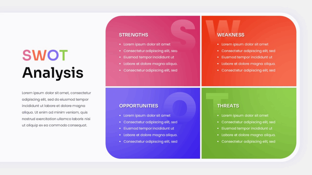
Present strategic insights clearly with this colorful SWOT matrix. Great for:
- Strategy and planning meetings
- Competitive analysis overviews
- Group discussions with visually balanced content
The color-coded matrix helps your audience digest strengths, weaknesses, opportunities, and threats quickly and visually.
Final Tips to Make Your Google Slides Stand Out
- Design for your audience, not for yourself.
- Simplicity always beats decoration.
- If something feels cluttered, it probably is.
- Reuse strong layouts instead of reinventing slides.
- Test your slides on different screens to ensure readability.
Learning how to make Google Slides look good is about mastering a few principles and applying them consistently. With thoughtful design choices and high-quality templates, you can create presentations that look professional, modern, and impactful—without spending hours on design.
Related Articles
 February 19th, 2026
How to Transfer Canva to Google Slides (Most Easy Methods)
Google Slides Tutorials- February 12th, 2026
How to Make Bullet Points in Google Slides (Step-by-Step Guide)
Google Slides Tutorials - March 13th, 2026
How to Create a Timeline in Google Slides (Step-by-Step Guide)
Google Slides Tutorials