- Understanding Vertical Slides in Google Slides
- How to Make Google Slides Vertical (Quick Setup)
- Choosing the Right Dimensions for Your Goal
- When Vertical Slides Are the Better Choice
- Designing for Vertical Slides Requires a Different Mindset
- Common Problems People Run Into Designing Vertical Google Slides
- Why Google Slides Still Makes Sense for Vertical Presentations
- Making Vertical Slides Feel Intentional, Not Accidental
- Final Thoughts

Most people open Google Slides, choose a template, and start designing without questioning the slide orientation. Horizontal slides have become the default, not because they are always better, but because they are familiar. Yet the way people consume content has changed. Phones are vertical. Scrolling is vertical. Reading habits are vertical. That shift is exactly why many creators, educators, marketers, and students are now asking a very specific question: how do you make Google Slides vertical—and how do you use that format effectively?
This article goes beyond the basic steps. You’ll learn not only how to change the orientation, but also when vertical slides make sense, how they influence design decisions, and how to avoid the common mistakes that make portrait presentations feel awkward or unprofessional.
Understanding Vertical Slides in Google Slides
Google Slides does not label orientation in the same way as traditional document editors. There is no “portrait” or “landscape” toggle. Instead, slide orientation is controlled by page dimensions.
This design choice is intentional. Google Slides is built for flexibility. Whether you want a wide cinematic deck, a square presentation, or a tall vertical layout, the tool gives you full control through custom sizing.
A vertical slide is simply a slide where the height is greater than the width. Once you understand that, the process becomes straightforward—but the implications for design are significant.
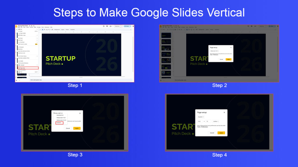
How to Make Google Slides Vertical (Quick Setup)
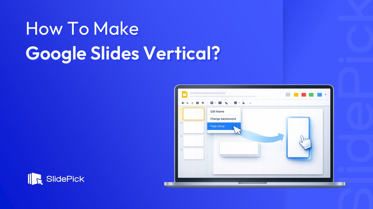
To create vertical slides in Google Slides, you need to adjust the page setup settings. Google allows custom slide dimensions, which you can modify from the Page setup menu (as explained in Google’s official documentation).
Let’s get the setup out of the way first.
- Open your presentation in Google Slides
- Click File → Page setup
- Open the dropdown (it usually says Widescreen 16:9)
- Select Custom
- Swap the width and height values
- Example:
- Horizontal: 10 in × 5.63 in
- Vertical: 5.63 in × 10 in
- Example:
- Click Apply
That’s it—your slides are now vertical.
But here’s where most articles stop. And honestly, that’s where the real problems usually begin.
Choosing the Right Dimensions for Your Goal
One of the biggest mistakes people make is choosing random dimensions without thinking about how the slides will be consumed.
If your presentation is designed primarily for mobile viewing, a tall 9:16 ratio works best because it mirrors the shape of a phone screen. If your goal is to print the slides as handouts or posters, standard paper sizes like A4 or US Letter make more sense. For social media content, slightly shorter vertical ratios often perform better because they fit naturally into feeds without being cropped.
The key idea is simple: slide size is a communication decision, not just a technical one. The format should serve the context in which your audience will see it.
When Vertical Slides Are the Better Choice
Vertical slides are not a replacement for horizontal decks. They are a different tool for a different job.
They work especially well when your audience is likely to view the content on a phone. A vertical presentation removes the need to rotate the device or zoom in, which lowers friction and keeps attention focused on the message.
Vertical slides also shine when you are telling a linear story. Tutorials, explainers, timelines, and step-by-step narratives feel more natural when content flows from top to bottom. This format closely resembles scrolling through an article or a social feed, which most users already know how to do intuitively.
Another strong use case is content reuse. A vertical Google Slides deck can easily be exported as a PDF, shared as a digital guide, or broken into individual images for social media. One well-designed presentation can serve multiple purposes without major redesign work.
Designing for Vertical Slides Requires a Different Mindset
Changing the slide orientation without changing your design approach often leads to cluttered, unbalanced slides. Vertical layouts ask you to rethink structure.
Instead of spreading elements across the slide from left to right, vertical slides work best when content is stacked intentionally. Headlines should lead at the top, followed by supporting visuals or text, and then a clear conclusion or call to action near the bottom.
Spacing becomes even more important. Vertical slides give you more height, but that doesn’t mean you should fill every inch. White space helps guide the eye and makes content easier to scan, especially on smaller screens.
Text size also needs adjustment. Vertical slides are often viewed on phones, where small text becomes unreadable quickly. If something looks slightly large on your laptop, it will probably look just right on a mobile device.
Common Problems People Run Into Designing Vertical Google Slides
One common issue with vertical slides is unexpected cropping when exporting or sharing. This usually happens when content is placed too close to the edges. Leaving generous margins helps ensure that nothing gets cut off when the presentation is viewed on different devices or converted into a PDF.
Another problem is overloading slides with information. The extra vertical space can create the illusion that you can fit more content, but that often reduces clarity. Vertical slides are most effective when each slide focuses on a single idea and communicates it clearly.
Templates can also be a challenge. Most Google Slides templates are designed for horizontal layouts, and forcing them into a vertical format rarely works well. Starting with a blank slide and building your own structure usually produces better results.
Why Google Slides Still Makes Sense for Vertical Presentations
There are many design tools that support vertical formats, but Google Slides remains a strong choice, especially within the ecosystem of Google.
Its cloud-based nature makes collaboration easy. Sharing, commenting, and real-time editing work just as smoothly with vertical slides as with traditional ones. Exporting to PDF or images is simple, and most teams already know how to use the platform, which removes the learning curve.
For creators who value clarity, speed, and accessibility over flashy effects, Google Slides is more than capable of handling vertical presentations effectively.
Making Vertical Slides Feel Intentional, Not Accidental
What separates a good vertical presentation from an awkward one is intention.
Preview your slides on the device your audience will use. Scroll through them as if you were a viewer, not a creator. Pay attention to pacing, readability, and visual flow. Ask yourself whether each slide earns its space or simply fills it.
When vertical slides are designed with purpose, they don’t feel like rotated horizontal decks. They feel modern, thoughtful, and aligned with how people actually consume content today.
Final Thoughts
Making Google Slides vertical is technically simple, but the real value lies in how you use that format. Vertical slides work best when they align with your audience’s habits, your content’s structure, and your presentation’s goals.
If your message is meant to be read, scrolled, or viewed on mobile devices, vertical slides are not just an alternative—they are often the smarter choice. When designed with care, they can transform a standard presentation into a more engaging and versatile piece of content.
Related Articles
 March 12th, 2026
25 Google Slides Tricks and Tips to Make Every Google Slides Presentation Look Professional
Google Slides Tutorials- February 12th, 2026
How to Make Bullet Points in Google Slides (Step-by-Step Guide)
Google Slides Tutorials - February 4th, 2026
How to Make Google Slides Look Good: Tips To Follow
Google Slides Tutorials