Free Clustered Column Chart Analysis Template for PowerPoint & Google Slides


Product Description
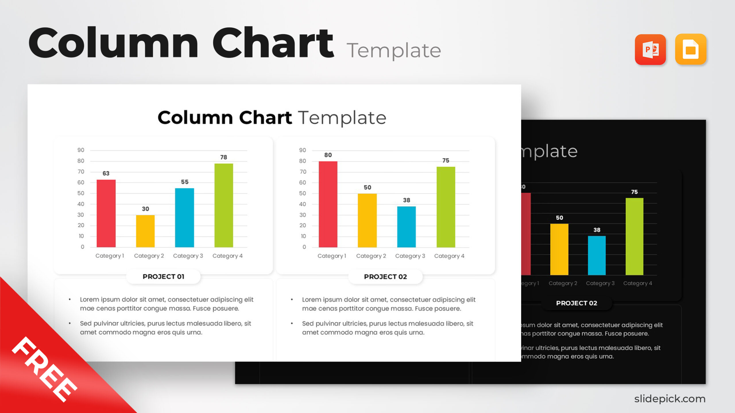
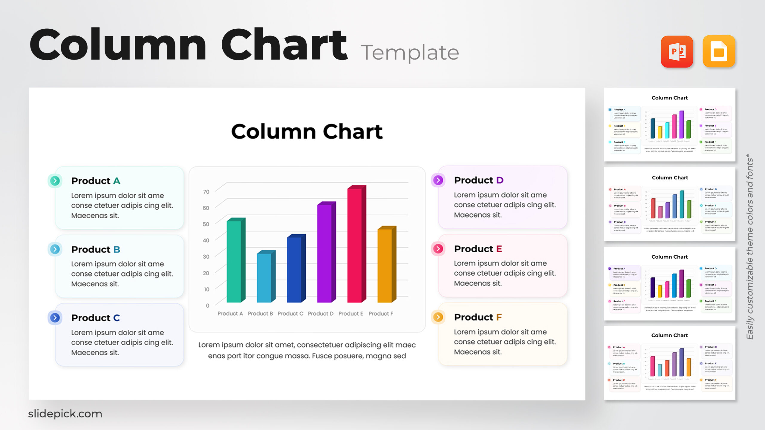
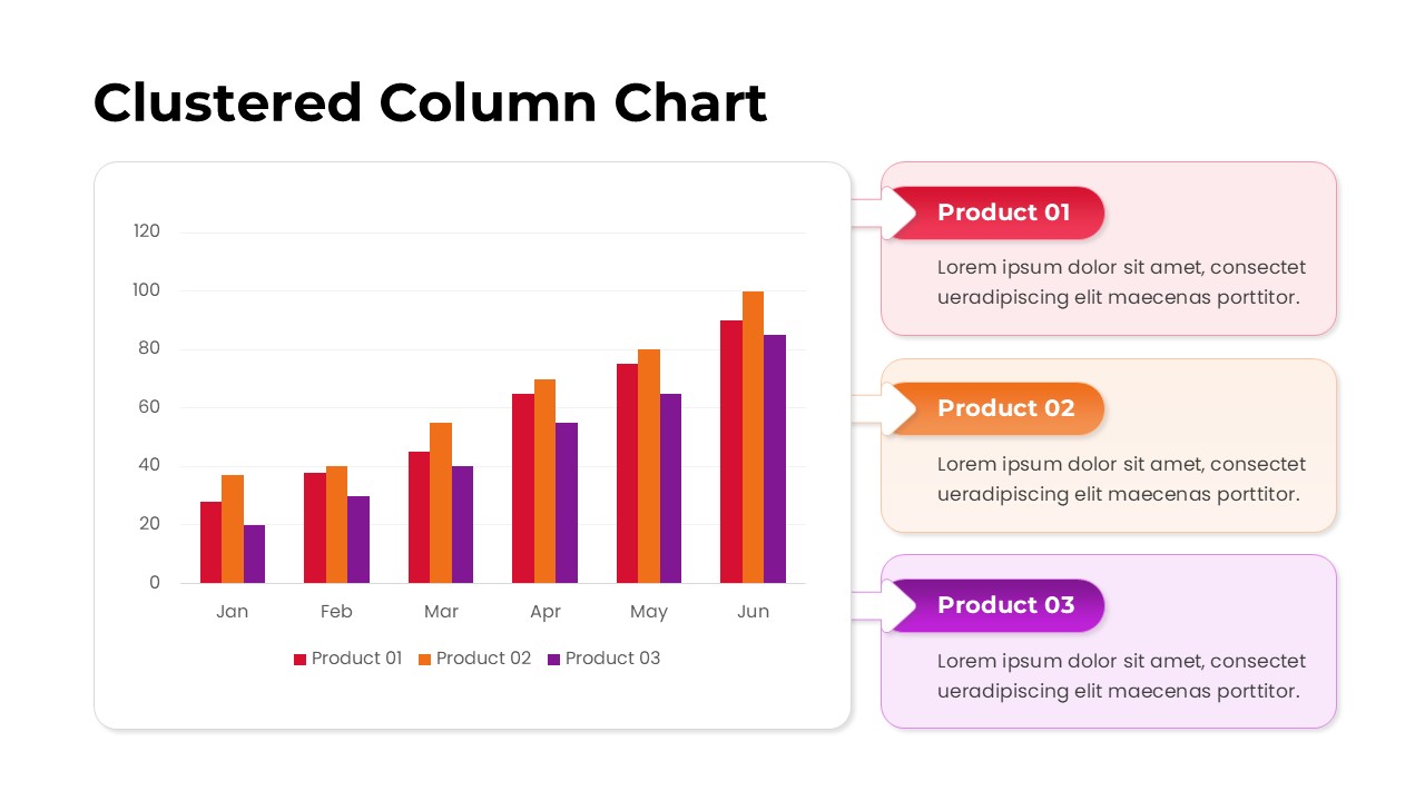
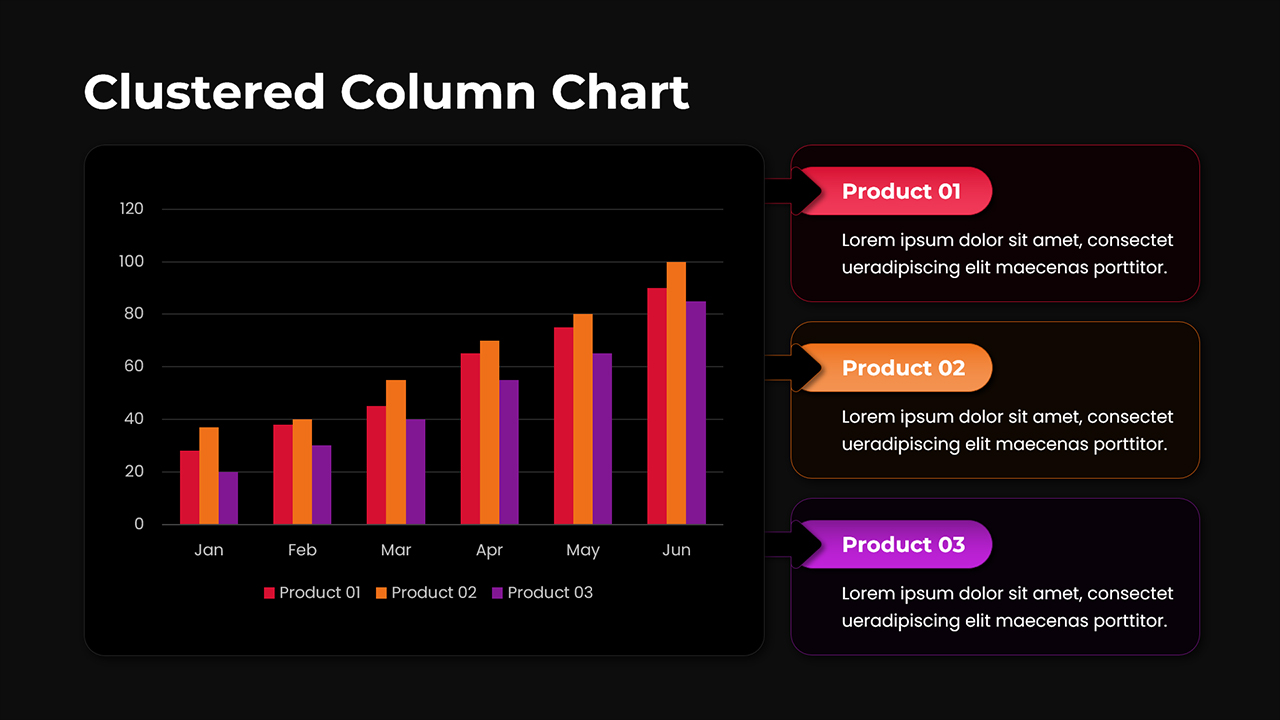
Present your comparative data in a visually compelling way with this Clustered Column Chart Analysis Template for PowerPoint and Google Slides. The slide features a clear and professional column chart that compares three distinct product performance trends across six months, from January to June. Each data series—Product 01, Product 02, and Product 03—is represented in vivid red, orange, and purple bars respectively, ensuring instant visual distinction. The right-hand section integrates matching color-coded text boxes with arrow connectors, providing space for concise product descriptions or analytical insights.
This modern, minimal layout is ideal for illustrating growth metrics, sales comparisons, or performance benchmarks in quarterly or annual reports. Fully editable chart elements and placeholders allow users to customize data points, colors, and captions with ease. The rounded-corner design, soft shadows, and balanced typography give the chart a clean, corporate feel that fits seamlessly into business reports, dashboards, and presentations.
Optimized for both PowerPoint and Google Slides, this template guarantees high readability, data accuracy, and presentation efficiency. Its intuitive structure supports data-driven storytelling—helping teams identify patterns, track key indicators, and make strategic decisions faster.
Who is it for
Ideal for business analysts, marketing professionals, project managers, and executives seeking to visualize product or departmental performance. Data presenters, consultants, and educators can also use this slide to showcase comparative results in reports or training materials.
Other Uses
This clustered column chart can also be adapted for illustrating KPI trends, financial summaries, survey results, or market performance over time. It’s suitable for company dashboards, project status updates, and academic data presentations where multiple categories must be compared simultaneously.
Login to download this file
What do you think of this template?
-
Category:
Business -
-

-

File size: 16:9 (Widescreen)
-

Item ID: SPT0001
-

Color