Free Clustered Column Chart PowerPoint & Google Slides Template

Product Description
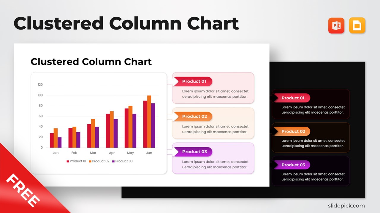
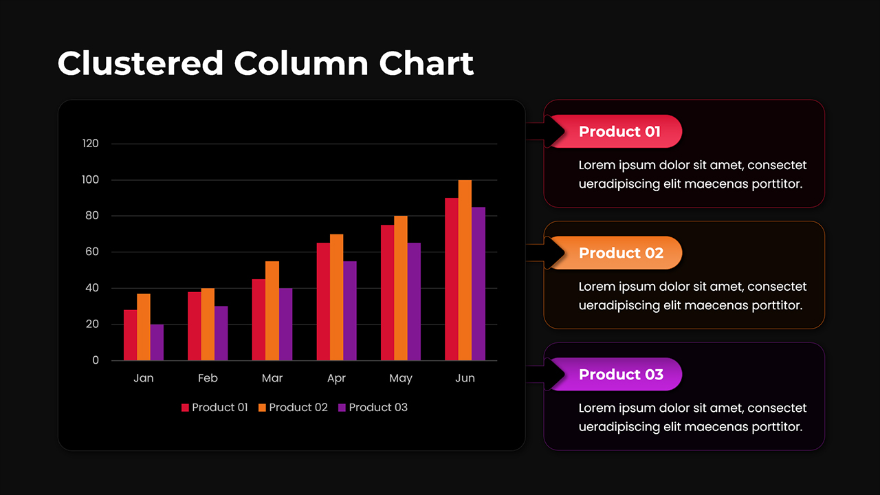
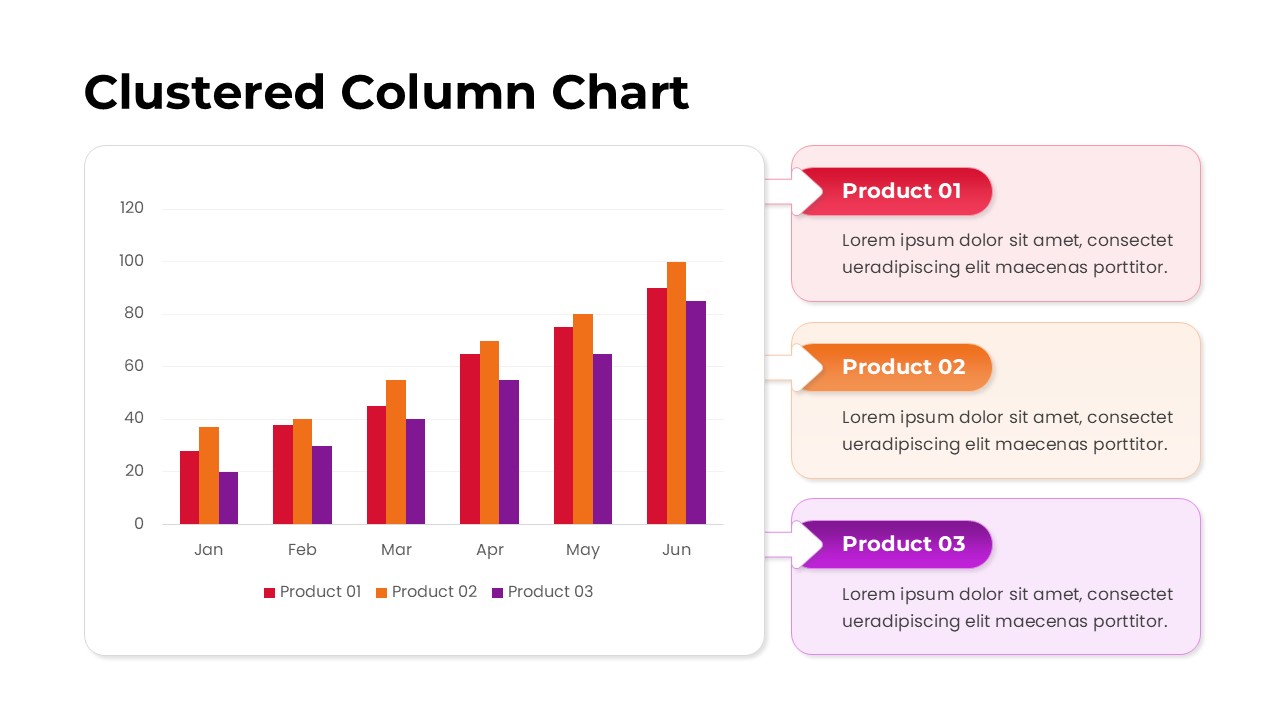
If your work involves presenting sales performance, product comparisons, or monthly growth data, communicating those numbers clearly is half the battle. This free clustered column chart template is built for business analysts, marketing professionals, product managers, and anyone who needs to turn raw data into a story an audience can actually follow. Available as both a PowerPoint template and a Google Slides presentation, it comes in two slide variations, a clean white version and a bold dark version, so it fits naturally into whatever visual identity your deck already has.
Key Features
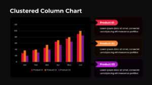
The centerpiece of this template is a well-structured clustered bar chart that plots three product lines, Product 01, Product 02, and Product 03, across a six-month period from January through June. Each month groups the three columns side by side in distinct colors (red, orange, and purple), making it immediately obvious how each product performs relative to the others at any given point in time. The Y-axis scales cleanly from 0 to 120, giving the chart enough room to show meaningful variance without crowding.
What sets this slide apart from a basic chart is the annotation panel on the right side. Each of the three products has its own labeled callout card connected visually to the chart with space for a short supporting description. This dual-layout approach means you don’t have to choose between showing the data and explaining it; both live on the same slide without competing for attention.
The two-slide format (light and dark) is a thoughtful touch. Light slides work well in printed reports or daytime presentations, while the dark variation holds up beautifully on large projector screens or video calls where contrast matters.
Use Cases
This free PowerPoint template is particularly well-suited for a wide range of real-world business scenarios:
Quarterly Business Reviews – Compare how multiple products, regions, or campaigns have trended month over month. A sales team presenting seasonal revenue figures across product categories can plug in numbers, update the callout labels, and be presentation-ready in minutes.
Marketing Performance Reports – Track channel performance (paid search vs. organic vs. social) over a rolling six-month window. The three-series structure maps naturally onto any scenario with three competing variables, whether that’s traffic sources, campaign types, or audience segments.
Investor Decks & Strategy Reviews – For startups and small businesses putting together pitch decks or internal strategy reviews, this Google Slides template delivers a level of visual polish that typically takes significant design time to build from scratch.
Product Line Comparisons – The callout cards beside the chart are especially useful for flagging notable trends like a spike in June without cluttering the chart itself with annotations. Ideal for product managers presenting SKU performance, departmental KPIs, or geographic market breakdowns to stakeholders.
Academic & Research Presentations – Works equally well outside the corporate world. Track three variables across a consistent time axis student cohort performance, survey response rates, or phased experiment outcomes with the same clean, readable structure.
Call to Action
Good data deserves a presentation that does it justice. This clustered column chart template from gives you a professionally designed, ready-to-edit slide that you can drop into your next PowerPoint or Google Slides deck in minutes. Whether you’re reporting upward to leadership or presenting outward to clients, the combination of clear chart layout and contextual callout cards means your audience spends less time decoding and more time understanding. Download it free and make your next data story one that actually lands.
Login to download this file
What do you think of this template?
Category:
Charts & Graphs
Aspect Ratio: 16:9
Item ID: SPT0001
Color
Related Templates
-
-
-
-
Free Market Share Pie Chart Template for PowerPoint & Google Slides
Business PowerPoint Templates
-
-
Free Triple Pie Chart Infographic for PowerPoint & Google Slides
Charts & Graphs
-
-
Free Market Share Analysis Template for PowerPoint & Google Slides
Business PowerPoint Templates
-
-
-
-
Radial Gauge Chart Google Slides & PowerPoint Template
Business PowerPoint Templates


