Free Colorful Column Chart Template for PowerPoint & Google Slides


Product Description
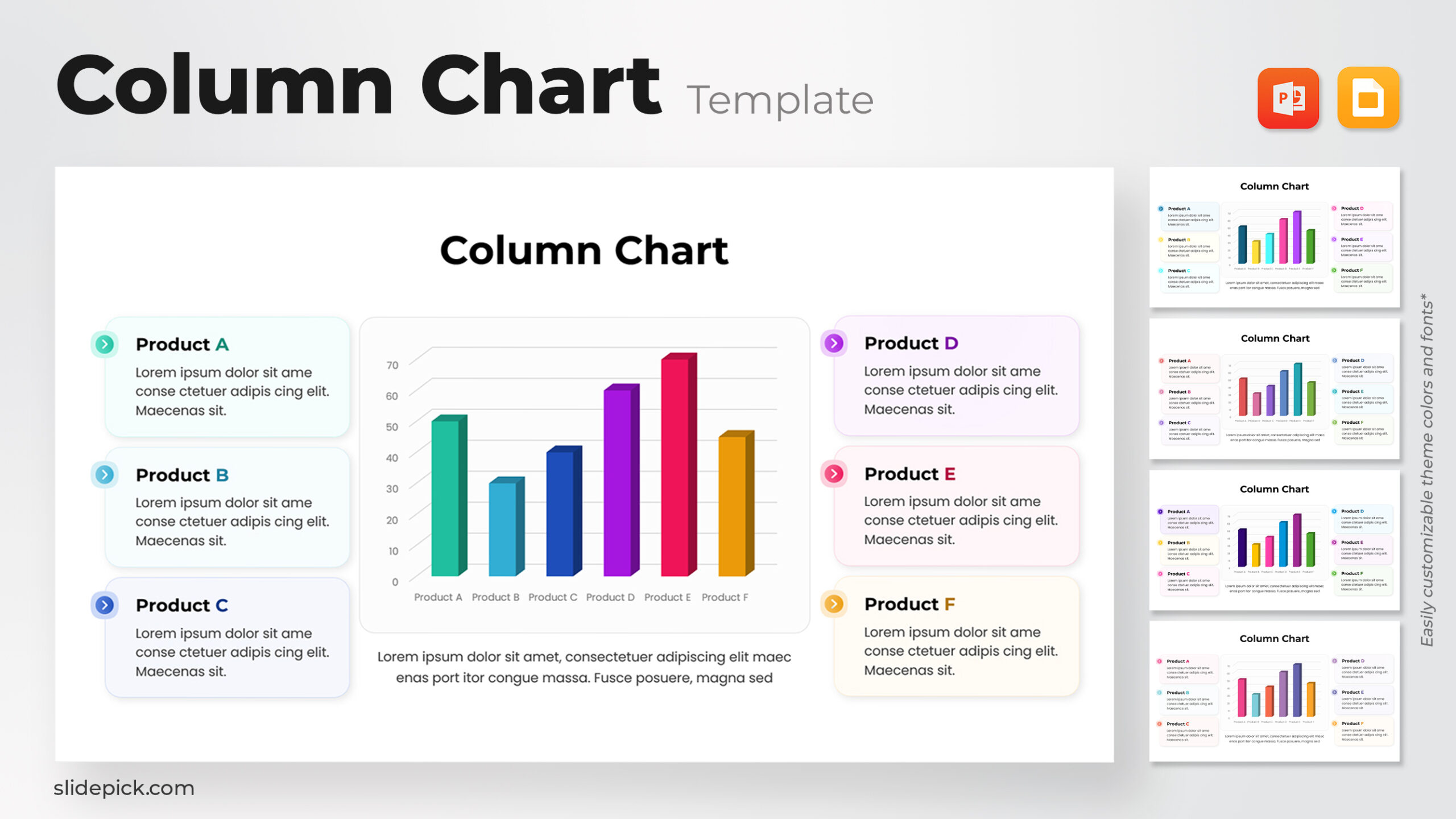
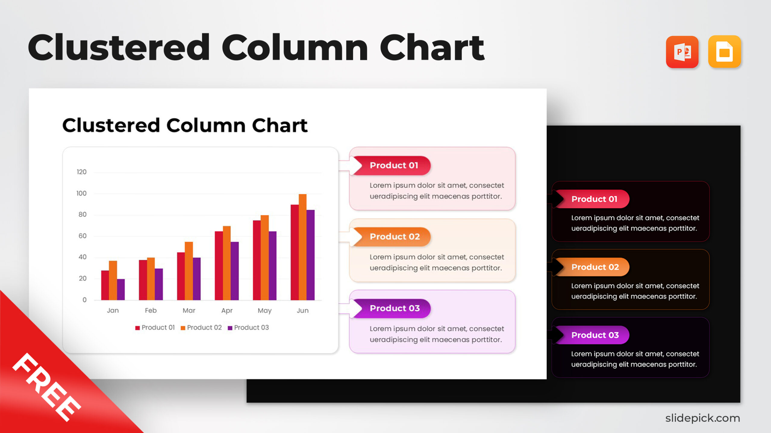
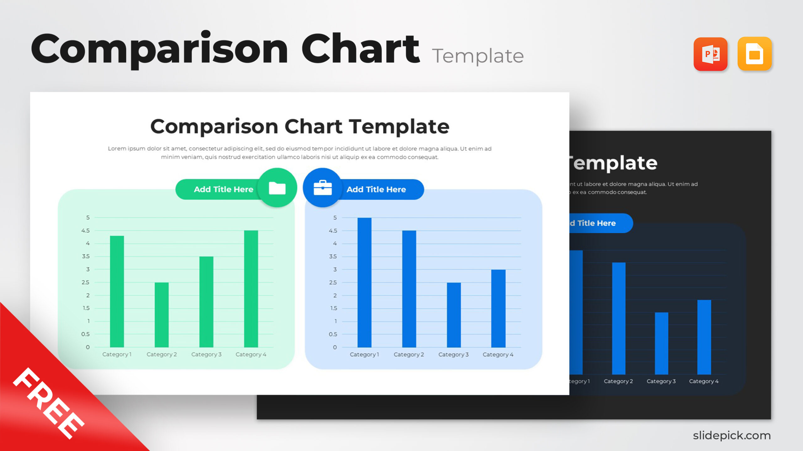
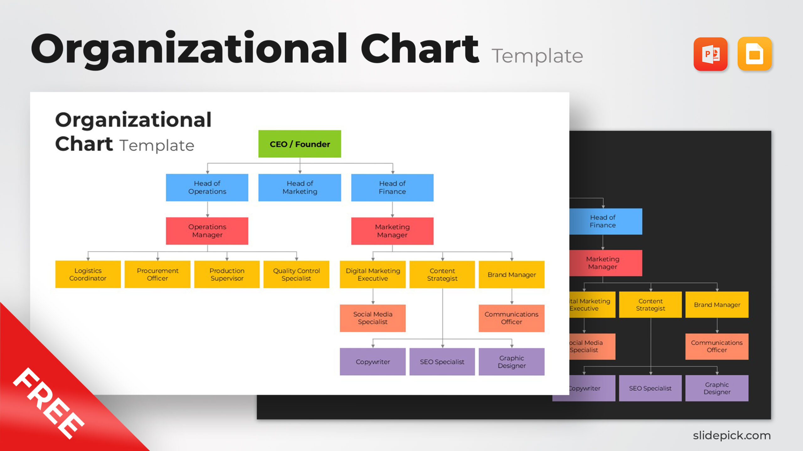
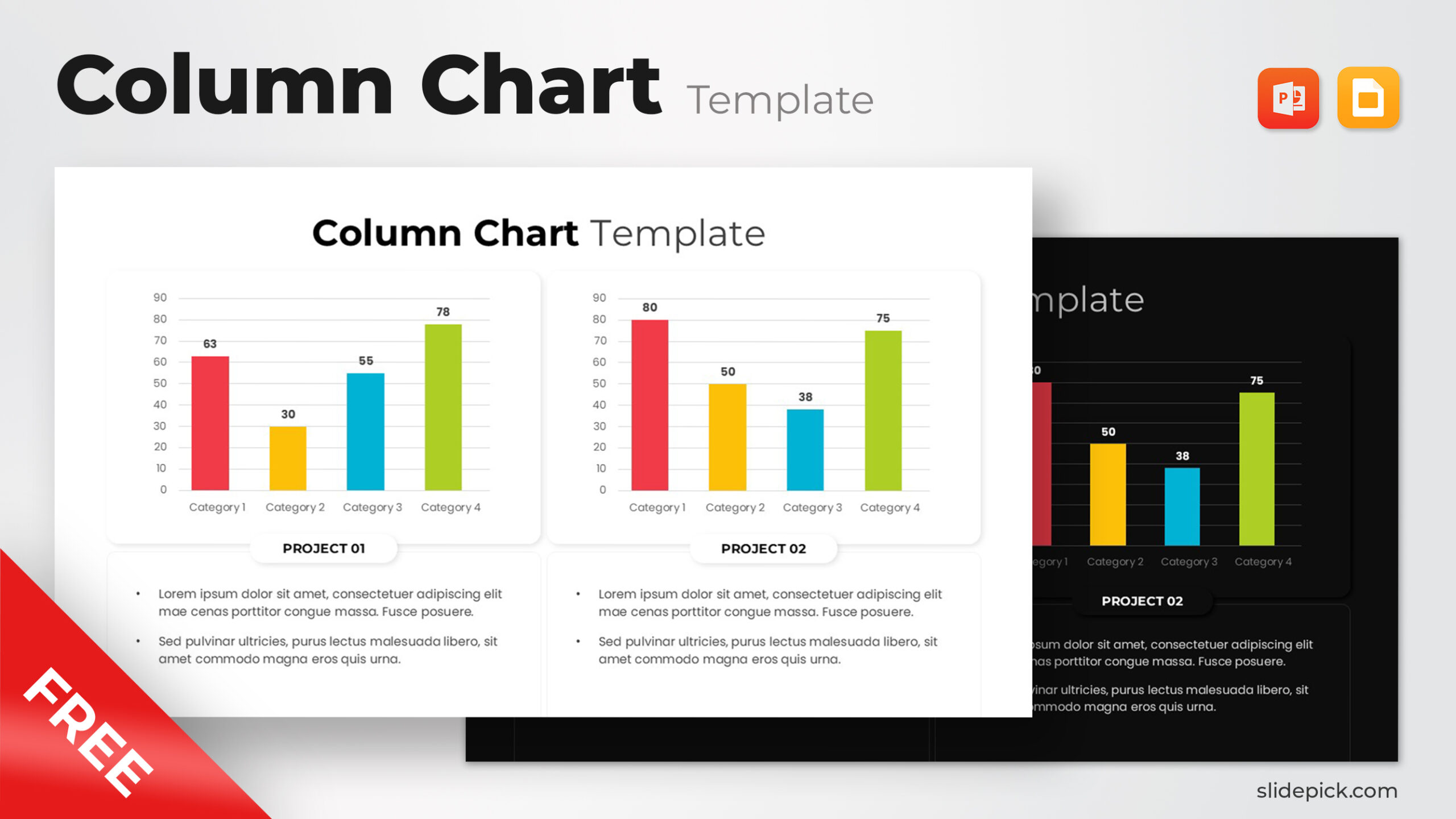
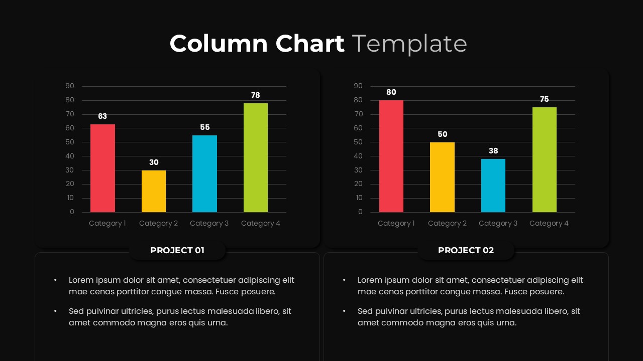
Visualize your project data and performance metrics with this Free Colorful Column Chart Template for PowerPoint and Google Slides. Designed with clarity and professionalism, this slide layout features dual column chart variations—perfect for comparing multiple projects, campaigns, or timelines. Each chart uses bright, contrasting colors (red, yellow, blue, and green) to differentiate categories clearly and improve data readability. The layout includes editable placeholders for project titles and descriptive text areas, helping you summarize insights or highlight takeaways beneath each chart.
The slide’s clean design employs a modern sans-serif typeface, soft-rounded chart containers, and both light and dark background options for versatile use across corporate, academic, or marketing presentations. Fully customizable, you can adjust the axes, data values, and color palettes to align with your brand identity or presentation theme. The consistent alignment and grid-based composition maintain visual balance, ensuring your data storytelling remains impactful and easy to follow.
Compatible with both PowerPoint and Google Slides, this column chart template simplifies complex data presentation and supports dynamic updates with editable chart elements. Ideal for showcasing KPIs, survey results, financial comparisons, or progress tracking in an engaging and professional manner.
Who is it for
This template is designed for project managers, data analysts, marketers, and business consultants who need to present performance comparisons, budget metrics, or campaign results effectively. It’s also ideal for educators and students visualizing research or statistical findings.
Other Uses
Repurpose this chart layout for financial dashboards, performance summaries, annual reports, academic data visualization, or team comparison slides. You can also use it in quarterly reviews, client presentations, or KPI reporting decks to convey numerical insights with visual clarity.
Login to download this file
What do you think of this template?
-
Category:
Business -
-

-

File size: 16:9 (Widescreen)
-

Item ID: SPT0012
-

Color