Line Chart Data Visualization Template for PowerPoint & Google Slides

Product Description
Description
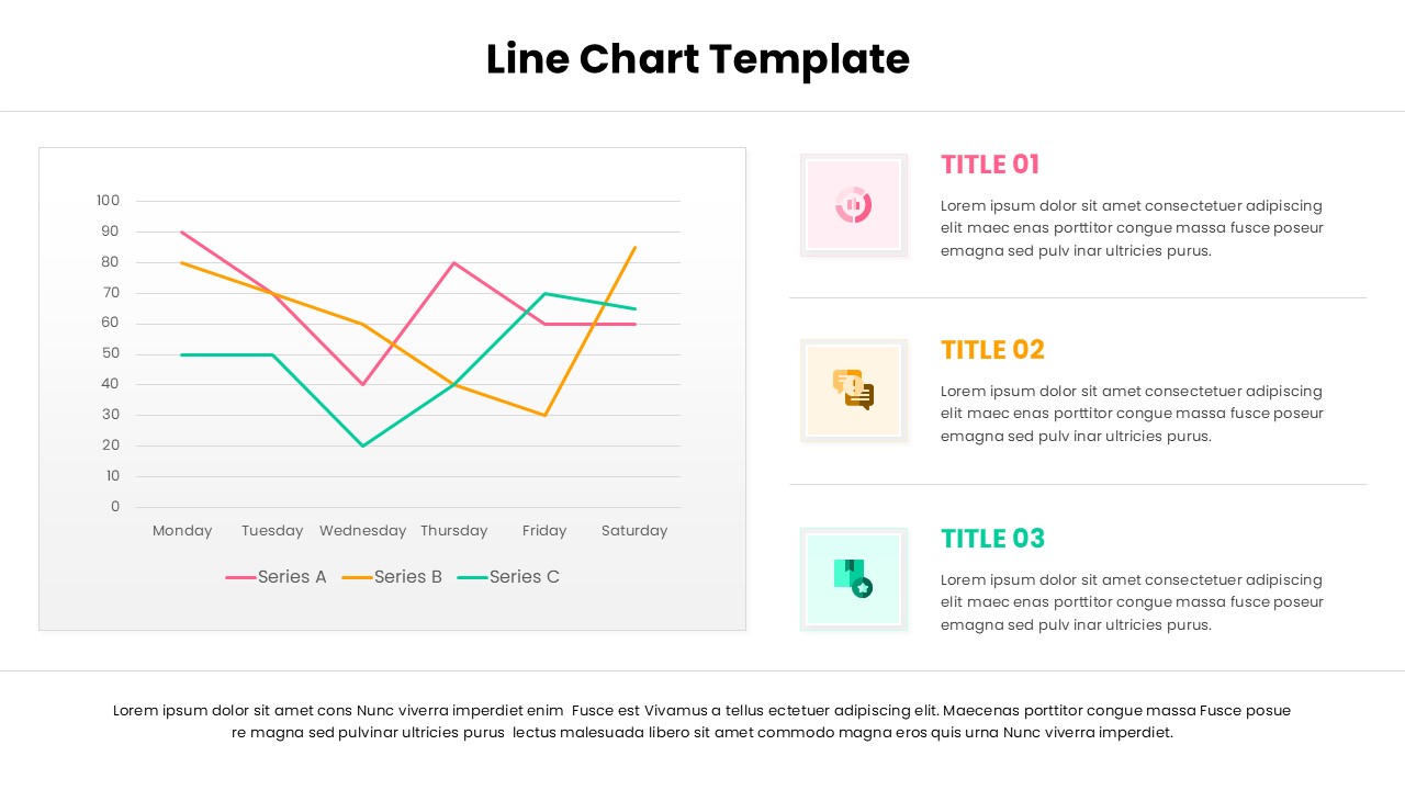
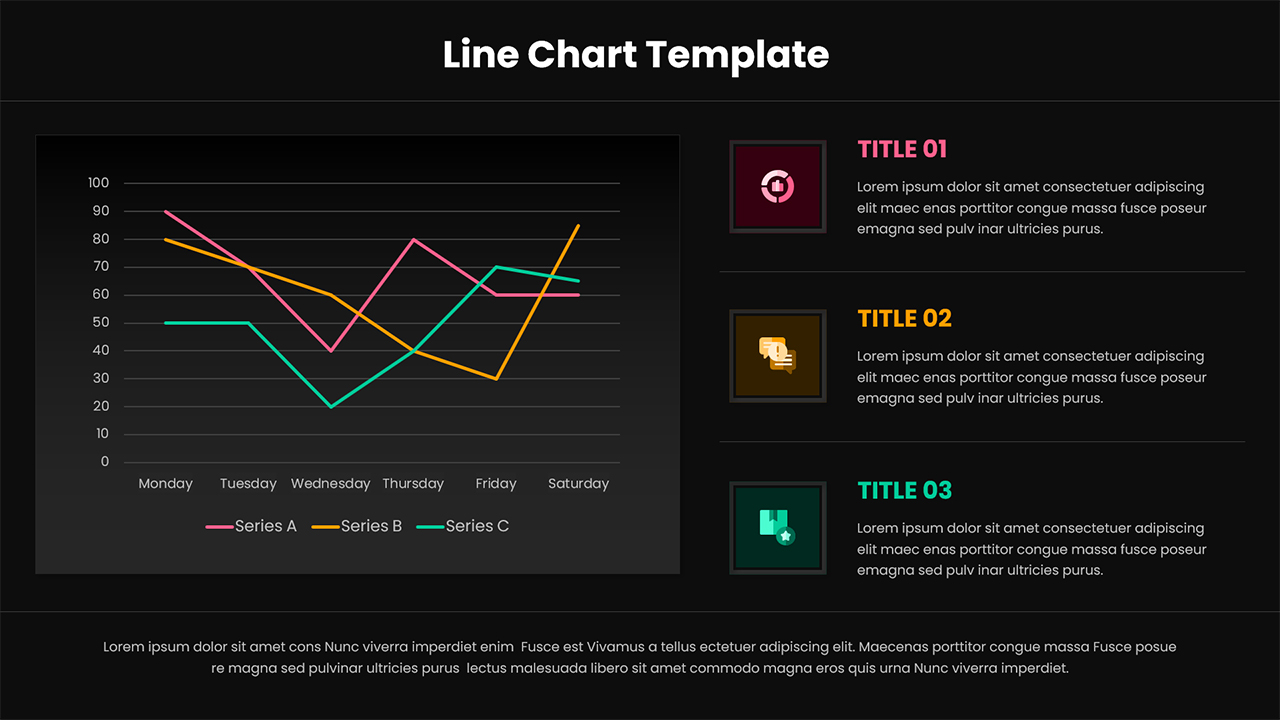
This line chart presentation template is designed for clear trend analysis and data comparison across time periods or categories. It is a fully editable presentation template, compatible with PowerPoint and Google Slides, allowing users to customize data, labels, and colors with ease. The layout focuses on visual clarity, making complex datasets easy to understand at a glance. Whether presenting business metrics or analytical insights, this template supports professional and accurate data storytelling.
The design combines a central multi-series line chart with supporting text sections, enabling presenters to explain patterns, fluctuations, and key takeaways without overcrowding the slide.
What’s Inside the Template
The template includes a primary slide featuring a clean line chart with multiple data series plotted across a horizontal timeline. The chart area is balanced with a structured content column that provides space for explanatory text blocks. Each section is visually separated, allowing users to describe insights, observations, or commentary related to the data shown. The slide uses consistent spacing, readable typography, and color coded data lines to maintain focus on trends rather than decoration.
Key Features
- Fully editable line chart with multiple data series
- Clear axis labeling suitable for time based or categorical data
- Balanced layout combining data visualization and text explanation
- Easy color customization for brand alignment
- Professional typography optimized for presentations
- High readability for reports, meetings, and dashboards
Ideal For
This template is ideal for business professionals, analysts, consultants, educators, and marketers who need to present trends, performance metrics, or comparisons over time. It works well in executive summaries, performance reviews, marketing reports, financial updates, and educational presentations where data accuracy and clarity are essential.
Slide Highlights
The slide highlights include a large, uncluttered line chart that immediately draws attention to data movement and comparisons. The adjacent text sections help contextualize the numbers, making it easier for audiences to interpret trends, identify peaks or drops, and understand implications. The overall design supports storytelling with data rather than simple chart display.
Compatibility & Formats
This template is fully compatible with Microsoft PowerPoint and Google Slides. All elements are editable directly within both platforms, with no additional fonts or plugins required. Users can quickly adapt the slide for different datasets, presentations, and reporting needs.
Login to download this file
What do you think of this template?
Category:
Business
Aspect Ratio: 16:9
Item ID: SPT0197
Color
Related Templates
-
-
-
-
-
-
-
-
Pie Chart Data Breakdown Template for PowerPoint & Google Slides
Charts & Graphs
-
Pie Chart Data Breakdown Template for PowerPoint & Google Slides
Charts & Graphs
-
-
-


