Multi-Color Pie Chart Data Breakdown Template for PowerPoint & Google Slides
Product Description
Description
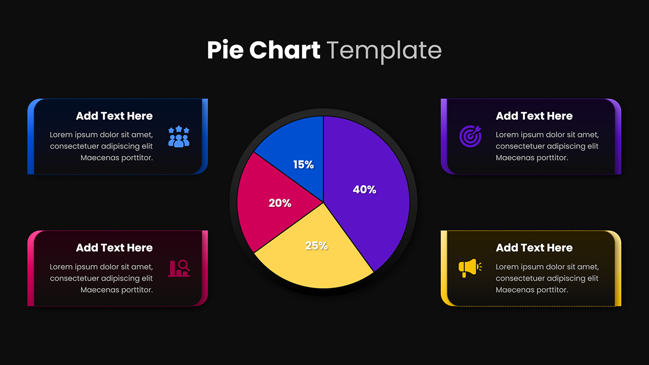
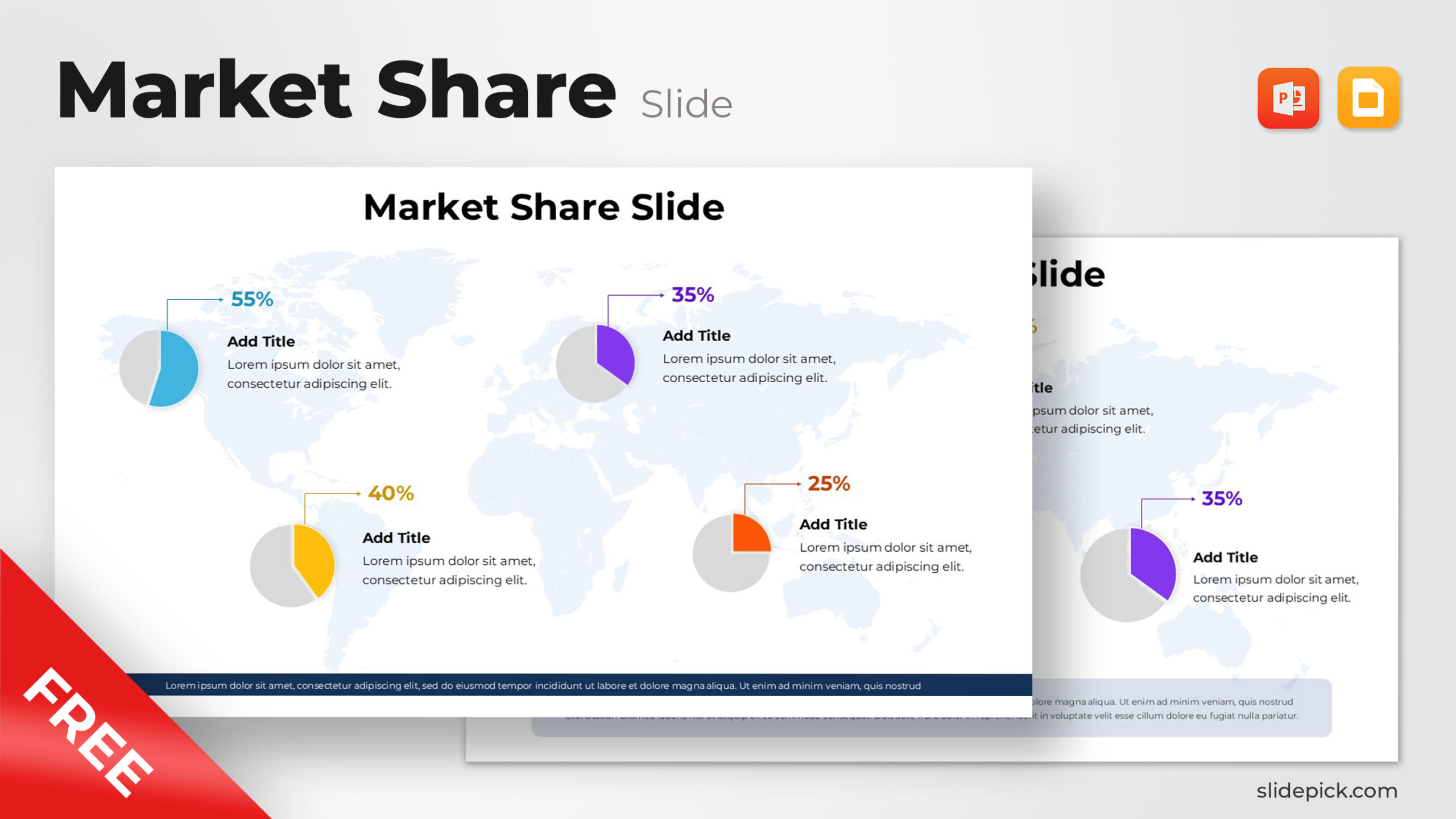
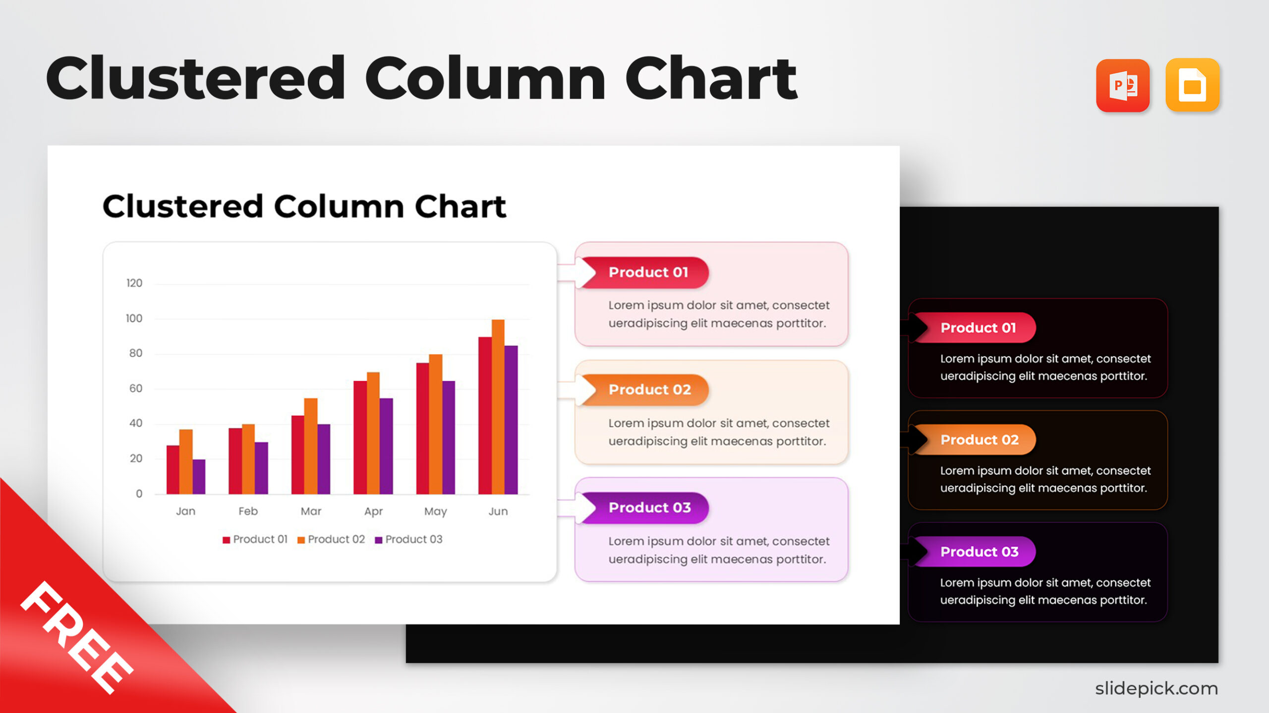
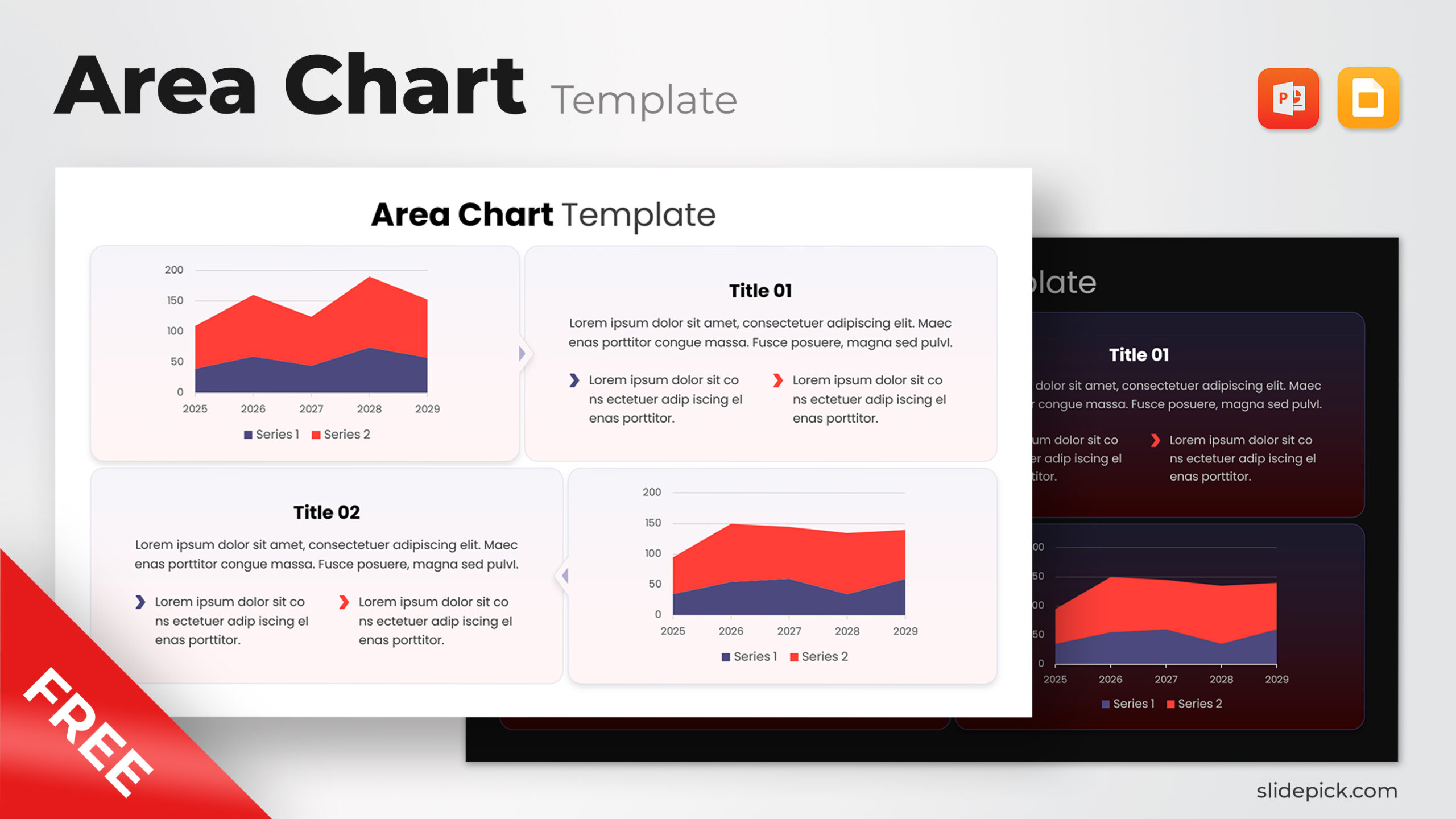
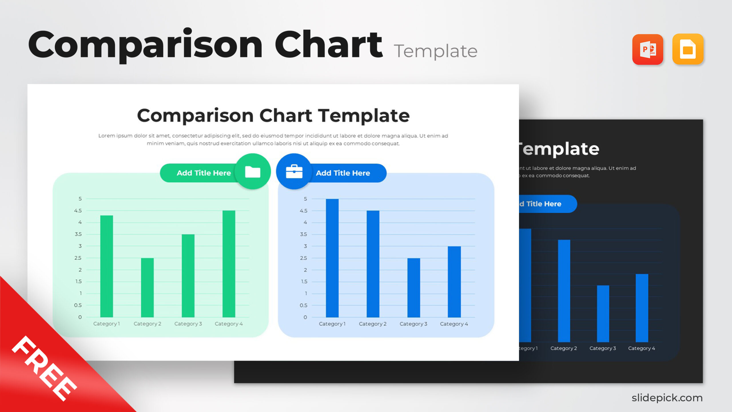
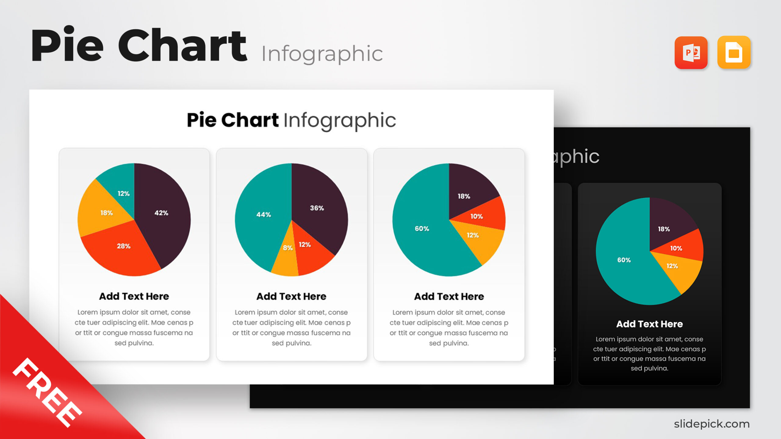
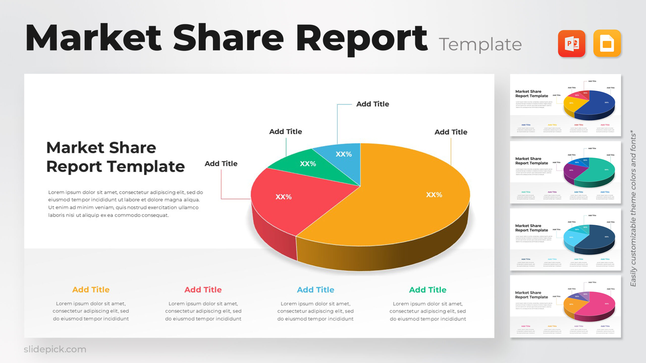
This multi-color pie chart layout provides a clear and engaging way to present proportional data, making it ideal for business reports, marketing summaries, and performance reviews. The central pie chart, divided into four distinct segments, visually highlights the relative contribution of each category, ensuring that audiences can grasp insights quickly and accurately. Surrounding text boxes allow you to expand on each data point, helping you create narratives that are both informative and visually cohesive.
Practical Application
This template supports a wide range of professional uses where visual clarity and structured explanation are essential. Whether you are summarizing survey findings, illustrating departmental budgets, or mapping out market segmentation, the design helps maintain strong readability while reinforcing key messages. The balanced combination of graphic and text elements ensures that each data segment is supported with concise contextual information.
Why It Works
The colorful palette and modern layout naturally guide the viewer’s eyes from the chart to its related descriptions, establishing a strong hierarchy of information. The design’s clean lines and rounded edges provide a polished, contemporary aesthetic that works seamlessly across corporate, educational, and analytical presentations. The format also encourages modular storytelling: presenters can emphasize each segment individually or collectively depending on the narrative structure of their presentation.
Other User Cases of the Template
budget allocation, survey analysis, customer segmentation, sales distribution, operational reporting, performance comparison, departmental review, product mix analysis
Login to download this file
What do you think of this template?


