Column Chart Template

This template is part of a deck featuring multiple slides. To check out all slides.
See All
Product Description
Description
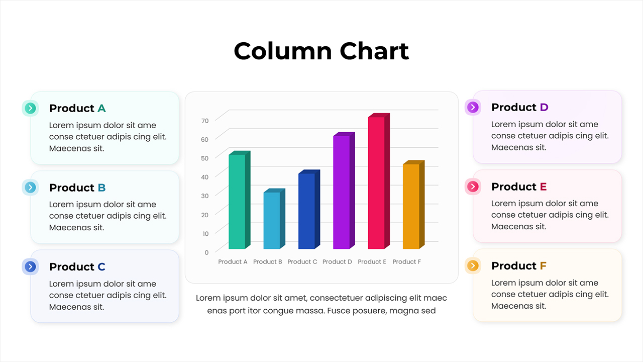
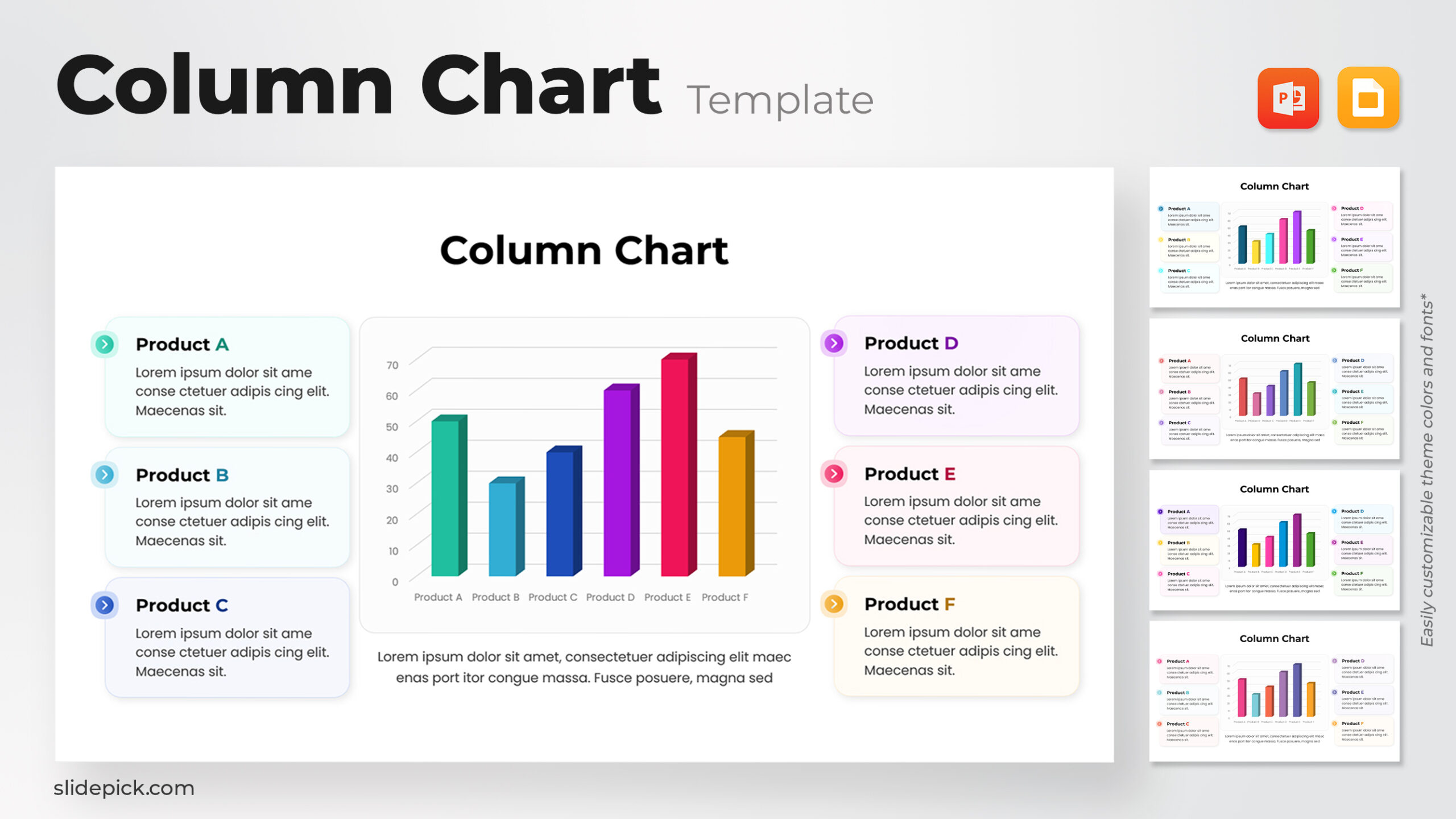
This multi-color column chart presentation slide offers a clear and visually engaging format for comparing multiple product performance metrics. Designed with a modern layout, the slide positions a vibrant central chart alongside structured text blocks, allowing you to highlight key insights with precision. Each product is paired with a dedicated color, enhancing readability and enabling quick pattern recognition. The clean spacing and minimalistic frame ensure the data remains the focal point while supporting text provides contextual depth.
Functionality & Use Cases
The template is ideal for showcasing comparative data, performance evaluations, quarterly or annual summaries, and any scenario that requires presenting numerical insights in a concise visual form. Its balanced layout supports both analytical clarity and storytelling, making it suitable for business presentations, marketing reviews, and stakeholder updates. The combination of color-coded bars and descriptive labels helps audiences interpret results at a glance, encouraging data-driven discussion and decision-making.
This chart layout also adapts well to broader reporting needs. Whether you are tracking KPIs, contrasting product lines, or displaying segmentation results, the slide accommodates a broad spectrum of metrics. Its structure ensures your content remains professional, accessible, and aligned with contemporary presentation standards.
Other User Cases of the Template
performance review, product comparison, KPI reporting, business reporting, campaign analysis, financial summary, market insights
Login to download this file
What do you think of this template?