Waterfall Chart PowerPoint & Google Slides Template

Product Description
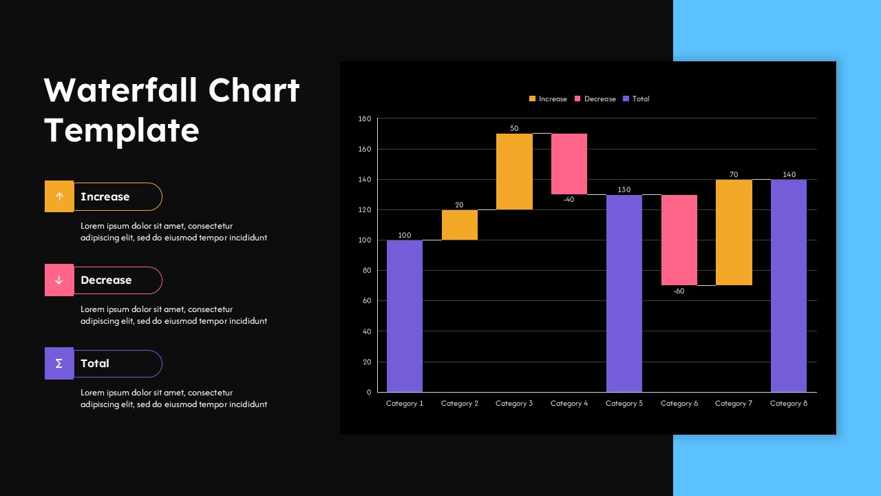
Waterfall Chart Template
This waterfall chart template provides a comprehensive solution for visualizing sequential data changes and cumulative effects in your business presentations. The template is a fully editable presentation resource designed specifically for PowerPoint and Google Slides compatibility. Both light and dark theme variations are included to match your presentation environment and brand guidelines. The primary benefit lies in transforming complex financial data and performance metrics into clear, professional visualizations that stakeholders can quickly understand and analyze.
The template features an intuitive three-color coding system that distinguishes between increases, decreases, and running totals. This systematic approach ensures your audience can immediately identify positive and negative impacts while following the cumulative progression of your data story.
What’s Inside the Waterfall Chart Template
The template contains two complementary slides with identical structural frameworks but different theme presentations. Each slide employs a balanced two-column layout with a dedicated sidebar for titles and legend information alongside the main chart area. The waterfall chart structure accommodates eight customizable categories with corresponding value labels and maintains proper scaling through adjustable Y-axis parameters. Legend sections include placeholder text for custom descriptions, while the chart framework supports both positive and negative value visualization through distinct color-coded bar segments.
Key Features of This Waterfall Chart Template
- Dual theme options with professional light and dark variations
- Three-color coding system for clear data categorization
- Fully customizable chart values and category labels
- Responsive layout design with proper spacing and hierarchy
- Editable legend sections for detailed explanations
- High-contrast design ensuring readability in any presentation setting
- Professional formatting suitable for executive-level presentations
Ideal For
This template serves financial analysts, business managers, and consultants who need to present variance analysis, budget comparisons, or performance tracking data. Corporate executives will find it valuable for board presentations and stakeholder meetings where financial charts require clear visual impact. The template works exceptionally well for quarterly reviews, profit and loss breakdowns, cash flow analysis, and any scenario where sequential positive and negative changes need professional visualization. Strategy consultants and business development professionals can leverage this format for client presentations and internal reporting requirements.
Slide Highlights
The design emphasizes clarity through strategic use of white space and balanced proportions that guide viewer attention naturally from legend to chart data. Both theme variations maintain consistent visual hierarchy while providing flexibility for different presentation environments. The chart’s sequential flow design helps audiences follow complex data stories without confusion, while the professional color palette ensures corporate appropriateness. The dark theme option adds modern sophistication perfect for executive dashboards and contemporary business analysis presentations, while the light version offers classic reliability for traditional corporate settings.
Compatibility & Formats
Designed for seamless integration with both PowerPoint and Google Slides platforms, this template supports easy editing of all chart elements, text components, and color schemes. The 16:9 aspect ratio ensures optimal display across modern presentation screens and devices, while the editable format allows complete customization to match your specific data requirements and brand guidelines.
Login to download this file
What do you think of this template?
Category:
Charts & Graphs
Aspect Ratio: 16:9
Item ID: SPT0552
Color
Related Templates
-
Pareto 80/20 Rule Chart PowerPoint & Google Slides Template
Charts & Graphs
-
-
-
-
-
-
-
-
-
-
-
Blue Ocean Strategy Canvas Infographic for PowerPoint & Google Slides
Business Strategy


